library(tidyverse)27 Logistic regression
27.1 Finding wolf spiders on the beach
A team of Japanese researchers were investigating what would cause the burrowing wolf spider Lycosa ishikariana to be found on a beach. They hypothesized that it had to do with the size of the grains of sand on the beach. They went to 28 beaches in Japan, measured the average sand grain size (in millimetres), and observed the presence or absence of this particular spider on each beach. The data are in link.
Why would logistic regression be better than regular regression in this case?
Read in the data and check that you have something sensible. (Look at the data file first: the columns are aligned.)
Make a boxplot of sand grain size according to whether the spider is present or absent. Does this suggest that sand grain size has something to do with presence or absence of the spider?
Fit a logistic regression predicting the presence or absence of spiders from the grain size, and obtain its
summary. Note that you will need to do something with the response variable first.Is there a significant relationship between grain size and presence or absence of spiders at the \(\alpha=0.10\) level? Explain briefly.
Obtain predicted probabilities of spider presence for a representative collection of grain sizes. I only want predicted probabilities, not any kind of intervals.
Given your previous work in this question, does the trend you see in your predicted probabilities surprise you? Explain briefly.
27.2 Killing aphids
An experiment was designed to examine how well the insecticide rotenone kills aphids that feed on the chrysanthemum plant called Macrosiphoniella sanborni. The explanatory variable is the log concentration (in milligrams per litre) of the insecticide. At each of the five different concentrations, approximately 50 insects were exposed. The number of insects exposed at each concentration, and the number killed, are shown below.
Log-Concentration   Insects exposed    Number killed
0.96                       50              6
1.33                       48              16
1.63                       46              24
2.04                       49              42
2.32                       50              44
Get these data into R. You can do this by copying the data into a file and reading that into R (creating a data frame), or you can enter the data manually into R using
c, since there are not many values. In the latter case, you can create a data frame or not, as you wish. Demonstrate that you have the right data in R.* Looking at the data, would you expect there to be a significant effect of log-concentration? Explain briefly.
Run a suitable logistic regression, and obtain a summary of the results. (There was a part (c) here before, but I took it out.)
Does your analysis support your answer to (here)? Explain briefly.
Obtain predicted probabilities of an insect’s being killed at each of the log-concentrations in the data set.
Obtain a plot of the predicted probabilities of an insect’s being killed, as it depends on the log-concentration.
People in this kind of work are often interested in the “median lethal dose”. In this case, that would be the log-concentration of the insecticide that kills half the insects. Based on your predictions, roughly what do you think the median lethal dose is?
27.3 The effects of Substance A
In a dose-response experiment, animals (or cell cultures or human subjects) are exposed to some toxic substance, and we observe how many of them show some sort of response. In this experiment, a mysterious Substance A is exposed at various doses to 100 cells at each dose, and the number of cells at each dose that suffer damage is recorded. The doses were 10, 20, … 70 (mg), and the number of damaged cells out of 100 were respectively 10, 28, 53, 77, 91, 98, 99.
Find a way to get these data into R, and show that you have managed to do so successfully.
Would you expect to see a significant effect of dose for these data? Explain briefly.
Fit a logistic regression modelling the probability of a cell being damaged as it depends on dose. Display the results. (Comment on them is coming later.)
Does your output indicate that the probability of damage really does increase with dose? (There are two things here: is there really an effect, and which way does it go?)
Obtain predicted damage probabilities for some representative doses.
Draw a graph of the predicted probabilities, and to that add the observed proportions of damage at each dose. Hints: you will have to calculate the observed proportions first. See here, near the bottom, to find out how to add data to one of these graphs. The
geom_pointline is the one you need.
Looking at the predicted probabilities, would you say that the model fits well? Explain briefly.
27.4 What makes an animal get infected?
Some animals got infected with a parasite. We are interested in whether the likelihood of infection depends on any of the age, weight and sex of the animals. The data are at link. The values are separated by tabs.
Read in the data and take a look at the first few lines. Is this one animal per line, or are several animals with the same age, weight and sex (and infection status) combined onto one line? How can you tell?
* Make suitable plots or summaries of
infectedagainst each of the other variables. (You’ll have to think aboutsex, um, you’ll have to think about thesexvariable, because it too is categorical.) Anything sensible is OK here. You might like to think back to what we did in Question here for inspiration. (You can also investigatetable, which does cross-tabulations.)Which, if any, of your explanatory variables appear to be related to
infected? Explain briefly.Fit a logistic regression predicting
infectedfrom the other three variables. Display thesummary.* Which variables, if any, would you consider removing from the model? Explain briefly.
Are the conclusions you drew in (here) and (here) consistent, or not? Explain briefly.
* The first and third quartiles of
ageare 26 and 130; the first and third quartiles ofweightare 9 and 16. Obtain predicted probabilities for all combinations of these andsex. (You’ll need to start by making a new data frame, usingdatagridto get all the combinations.)
27.5 The brain of a cat
A large number (315) of psychology students were asked to imagine that they were serving on a university ethics committee hearing a complaint against animal research being done by a member of the faculty. The students were told that the surgery consisted of implanting a device called a cannula in each cat’s brain, through which chemicals were introduced into the brain and the cats were then given psychological tests. At the end of the study, the cats’ brains were subjected to histological analysis. The complaint asked that the researcher’s authorization to carry out the study should be withdrawn, and the cats should be handed over to the animal rights group that filed the complaint. It was suggested that the research could just as well be done with computer simulations.
All of the psychology students in the survey were told all of this. In addition, they read a statement by the researcher that no animal felt much pain at any time, and that computer simulation was not an adequate substitute for animal research. Each student was also given one of the following scenarios that explained the benefit of the research:
“cosmetic”: testing the toxicity of chemicals to be used in new lines of hair care products.
“theory”: evaluating two competing theories about the function of a particular nucleus in the brain.
“meat”: testing a synthetic growth hormone said to potentially increase meat production.
“veterinary”: attempting to find a cure for a brain disease that is killing domesticated cats and endangered species of wild cats.
“medical”: evaluating a potential cure for a debilitating disease that afflicts many young adult humans.
Finally, each student completed two questionnaires: one that would assess their “relativism”: whether or not they believe in universal moral principles (low score) or whether they believed that the appropriate action depends on the person and situation (high score). The second questionnaire assessed “idealism”: a high score reflects a belief that ethical behaviour will always lead to good consequences (and thus that if a behaviour leads to any bad consequences at all, it is unethical).1
After being exposed to all of that, each student stated their decision about whether the research should continue or stop.
I should perhaps stress at this point that no actual cats were harmed in the collection of these data (which can be found as a .csv file at link). The variables in the data set are these:
decision: whether the research should continue or stop (response)idealism: score on idealism questionnairerelativism: score on relativism questionnairegenderof studentscenarioof research benefits that the student read.
A more detailed discussion^(“[If you can believe it.] of this study is at link.
Read in the data and check by looking at the structure of your data frame that you have something sensible. Do not call your data frame
decision, since that’s the name of one of the variables in it.Fit a logistic regression predicting
decisionfromgender. Is there an effect of gender?To investigate the effect (or non-effect) of
gender, create a contingency table by feedingdecisionandgenderintotable. What does this tell you?* Is your slope for
genderin the previous logistic regression positive or negative? Is it applying to males or to females? Looking at the conclusions from your contingency table, what probability does that mean your logistic regression is actually modelling?Add the two variables
idealismandrelativismto your logistic regression. Do either or both of them add significantly to your model? Explain briefly.Add the variable
scenarioto your model. That is, fit a new model with that variable plus all the others.Use
anovato compare the models with and withoutscenario. You’ll have to add atest="Chisq"to youranova, to make sure that the test gets done. Doesscenariomake a difference or not, at \(\alpha=0.10\)? Explain briefly. (The reason we have to do it this way is thatscenariois a factor with five levels, so it has four slope coefficients. To test them all at once, which is what we need to make an overall test forscenario, this is the way it has to be done.)Look at the
summaryof your model that containedscenario. Bearing in mind that the slope coefficient forscenariocosmeticis zero (since this is the first scenario alphabetically), which scenarios have the most positive and most negative slope coefficients? What does that tell you about those scenarios’ effects?Describe the effects that having (i) a higher idealism score and (ii) a higher relativity score have on a person’s probability of saying that the research should stop. Do each of these increase or decrease that probability? Explain briefly.
27.6 How not to get heart disease
What is associated with heart disease? In a study, a large number of variables were measured, as follows:
age(years)sexmale or femalepain.typeChest pain type (4 values: typical angina, atypical angina, non-anginal pain, asymptomatic)resting.bpResting blood pressure, on admission to hospitalserum.cholSerum cholesterolhigh.blood.sugar: greater than 120, yes or noelectroresting electrocardiographic results (normal, having ST-T, hypertrophy)max.hrMaximum heart rateanginaExercise induced angina (yes or no)oldpeakST depression induced by exercise relative to rest. See link.slopeSlope of peak exercise ST segment. Sloping up, flat or sloping downcolorednumber of major vessels (0–3) coloured by fluoroscopythalnormal, fixed defect, reversible defectheart.diseaseyes, no (response)
I don’t know what most of those are, but we will not let that stand in our way. Our aim is to find out what variables are associated with heart disease, and what values of those variables give high probabilities of heart disease being present. The data are in link.
Read in the data. Display the first few lines and convince yourself that those values are reasonable.
In a logistic regression, what probability will be predicted here? Explain briefly but convincingly. (Is each line of the data file one observation or a summary of several?)
* Fit a logistic regression predicting heart disease from everything else (if you have a column called
XorX1, ignore that), and display the results.Quite a lot of our explanatory variables are factors. To assess whether the factor as a whole should stay or can be removed, looking at the slopes won’t help us very much (since they tell us whether the other levels of the factor differ from the baseline, which may not be a sensible comparison to make). To assess which variables are candidates to be removed, factors included (properly), we can use
drop1. Feeddrop1a fitted model and the wordstest="Chisq"(take care of the capitalization!) and you’ll get a list of P-values. Which variable is the one that you would remove first? Explain briefly.I’m not going to make you do the whole backward elimination (I’m going to have you use
stepfor that later), but do one step: that is, fit a model removing the variable you think should be removed, usingupdate, and then rundrop1again to see which variable will be removed next.Use
stepto do a backward elimination to find which variables have an effect on heart disease. Display your final model (which you can do by saving the output fromstepin a variable, and asking for the summary of that. Instep, you’ll need to specify a starting model (the one from part (here)), the direction of elimination, and the test to display the P-value for (the same one as you used indrop1). (Note: the actual decision to keep or drop explanatory variables is based on AIC rather than the P-value, with the result thatstepwill sometimes keep variables you would have dropped, with P-values around 0.10.)Display the summary of the model that came out of
step.We are going to make a large number of predictions. Create and save a data frame that contains predictions for all combinations of representative values for all the variables in the model that came out of
step. By “representative” I mean all the values for a categorical variable, and the five-number summary for a numeric variable. (Note that you will get a lot of predictions.)Find the largest predicted probability (which is the predicted probability of heart disease) and display all the variables that it was a prediction for.
Compare the
summaryof the final model fromstepwith your highest predicted heart disease probability and the values of the other variables that make it up. Are they consistent?
27.7 Successful breastfeeding
A regular pregnancy lasts 40 weeks, and a baby that is born at or before 33 weeks is called “premature”. The number of weeks at which a baby is born is called its “gestational age”. Premature babies are usually smaller than normal and may require special care. It is a good sign if, when the mother and baby leave the hospital to go home, the baby is successfully breastfeeding.
The data in link are from a study of 64 premature infants. There are three columns: the gestational age (a whole number of weeks), the number of babies of that gestational age that were successfully breastfeeding when they left the hospital, and the number that were not. (There were multiple babies of the same gestational age, so the 64 babies are summarized in 6 rows of data.)
Read the data into R and display the data frame.
Verify that there were indeed 64 infants, by having R do a suitable calculation on your data frame that gives the right answer for the right reason.
Do you think, looking at the data, that there is a relationship between gestational age and whether or not the baby was successfully breastfeeding when it left the hospital? Explain briefly.
Why is logistic regression a sensible technique to use here? Explain briefly.
Fit a logistic regression to predict the probability that an infant will be breastfeeding from its gestational age. Show the output from your logistic regression.
Does the significance or non-significance of the slope of
gest.agesurprise you? Explain briefly.Is your slope (in the
Estimatecolumn) positive or negative? What does that mean, in terms of gestational ages and breastfeeding? Explain briefly.Obtain the predicted probabilities that an infant will successfully breastfeed for a representative collection of gestational ages.
Make a graph of the predicted probability that an infant will successfully breastfeed as it depends on gestational age.
27.8 Making it over the mountains
In 1846, the Donner party (Donner and Reed families) left Springfield, Illinois for California in covered wagons. After reaching Fort Bridger, Wyoming, the leaders decided to find a new route to Sacramento. They became stranded in the eastern Sierra Nevada mountains at a place now called Donner Pass, when the region was hit by heavy snows in late October. By the time the survivors were rescued on April 21, 1847, 40 out of 87 had died.
After the rescue, the age and gender of each person in the party was recorded, along with whether they survived or not. The data are in link.
Read in the data and display its structure. Does that agree with the description in the previous paragraph?
Make graphical or numerical summaries for each pair of variables. That is, you should make a graph or numerical summary for each of
agevs.gender,agevs.
survivedandgendervs.survived. In choosing the kind of graph or summary that you will use, bear in mind thatsurvivedandgenderare factors with two levels.For each of the three graphs or summaries in the previous question, what do they tell you about the relationship between the pair of variables concerned? Explain briefly.
Fit a logistic regression predicting survival from age and gender. Display the summary.
Do both explanatory variables have an impact on survival? Does that seem to be consistent with your numerical or graphical summaries? Explain briefly.
Are the men typically older, younger or about the same age as the women? Considering this, explain carefully what the negative
gendermaleslope in your logistic regression means.Obtain predicted probabilities of survival for each combination of some representative ages and of the two genders in this dataset.
Do your predictions support your conclusions from earlier about the effects of age and gender? Explain briefly.
27.9 Who needs the most intensive care?
The “APACHE II” is a scale for assessing patients who arrive in the intensive care unit (ICU) of a hospital. These are seriously ill patients who may die despite the ICU’s best attempts. APACHE stands for “Acute Physiology And Chronic Health Evaluation”.2 The scale score is calculated from several physiological measurements such as body temperature, heart rate and the Glasgow coma scale, as well as the patient’s age. The final result is a score between 0 and 71, with a higher score indicating more severe health issues. Is it true that a patient with a higher APACHE II score has a higher probability of dying?
Data from one hospital are in link. The columns are: the APACHE II score, the total number of patients who had that score, and the number of patients with that score who died.
Read in and display the data (however much of it displays). Why are you convinced that have the right thing?
Does each row of the data frame relate to one patient or sometimes to more than one? Explain briefly.
Explain why this is the kind of situation where you need a two-column response.
Fit a logistic regression to estimate the probability of death from the
apachescore, and display the results.Is there a significant effect of
apachescore on the probability of survival? Explain briefly.Is the effect of a larger
apachescore to increase or to decrease the probability of death? Explain briefly.Obtain the predicted probability of death for a representative collection of the
apachescores that were in the data set. Do your predictions behave as you would expect (from your earlier work)?Make a plot of predicted death probability against
apachescore (joined by lines) with, also on the plot, the observed proportion of deaths within eachapachescore, plotted againstapachescore. Does there seem to be good agreement between observation and prediction? Hint: calculate what you need to from the original dataframe first, save it, then make a plot of the predictions, and then to the plot add the appropriate thing from the dataframe you just saved.
27.10 Go away and don’t come back!
When a person has a heart attack and survives it, the major concern of health professionals is to prevent the person having a second heart attack. Two factors that are believed to be important are anger and anxiety; if a heart attack survivor tends to be angry or anxious, they are believed to put themselves at increased risk of a second heart attack.
Twenty heart attack survivors took part in a study. Each one was given a test designed to assess their anxiety (a higher score on the test indicates higher anxiety), and some of the survivors took an anger management course. The data are in link; y and n denote “yes” and “no” respectively. The columns denote (i) whether or not the person had a second heart attack, (ii) whether or not the person took the anger management class, (iii) the anxiety score.
Read in and display the data.
* Fit a logistic regression predicting whether or not a heart attack survivor has a second heart attack, as it depends on anxiety score and whether or not the person took the anger management class. Display the results.
In the previous part, how can you tell that you were predicting the probability of having a second heart attack (as opposed to the probability of not having one)?
* For the two possible values
yandnofangerand the anxiety scores 40, 50 and 60, make a data frame containing all six combinations, and use it to obtain predicted probabilities of a second heart attack. Display your predicted probabilities side by side with what they are predictions for.Use your predictions from the previous part to describe the effect of changes in
anxietyandangeron the probability of a second heart attack.Are the effects you described in the previous part consistent with the
summaryoutput fromglmthat you obtained in (here)? Explain briefly how they are, or are not. (You need an explanation for each ofanxietyandanger, and you will probably get confused if you look at the P-values, so don’t.)
My solutions follow:
27.11 Finding wolf spiders on the beach
A team of Japanese researchers were investigating what would cause the burrowing wolf spider Lycosa ishikariana to be found on a beach. They hypothesized that it had to do with the size of the grains of sand on the beach. They went to 28 beaches in Japan, measured the average sand grain size (in millimetres), and observed the presence or absence of this particular spider on each beach. The data are in link.
- Why would logistic regression be better than regular regression in this case?
Solution
Because the response variable, whether or not the spider is present, is a categorical yes/no success/failure kind of variable rather than a quantitative numerical one, and when you have this kind of response variable, this is when you want to use logistic regression.
\(\blacksquare\)
- Read in the data and check that you have something sensible. (Look at the data file first: the columns are aligned.)
Solution
The nature of the file means that you need read_table:
my_url <- "http://ritsokiguess.site/datafiles/spiders.txt"
spider <- read_table(my_url)
── Column specification ────────────────────────────────────────────────────────
cols(
  Grain.size = col_double(),
  Spiders = col_character()
)spiderWe have a numerical sand grain size and a categorical variable Spiders that indicates whether the spider was present or absent. As we were expecting. (The categorical variable is actually text or chr, which will matter in a minute.)
\(\blacksquare\)
- Make a boxplot of sand grain size according to whether the spider is present or absent. Does this suggest that sand grain size has something to do with presence or absence of the spider?
Solution
ggplot(spider, aes(x = Spiders, y = Grain.size)) + geom_boxplot()
The story seems to be that when spiders are present, the sand grain size tends to be larger. So we would expect to find some kind of useful relationship in the logistic regression.
Note that we have reversed the cause and effect here: in the boxplot we are asking “given that the spider is present or absent, how big are the grains of sand?”, whereas the logistic regression is asking “given the size of the grains of sand, how likely is the spider to be present?”. But if one variable has to do with the other, we would hope to see the link either way around.
\(\blacksquare\)
- Fit a logistic regression predicting the presence or absence of spiders from the grain size, and obtain its
summary. Note that you will need to do something with the response variable first.
Solution
The presence or absence of spiders is our response. This is actually text at the moment:
spiderso we need to make a factor version of it first. I’m going to live on the edge and overwrite everything:
spider <- spider %>% mutate(Spiders = factor(Spiders))
spider
Spiders is now a factor, correctly. (Sometimes a text variable gets treated as a factor, sometimes it needs to be an explicit factor. This is one of those times.) Now we go ahead and fit the model. I’m naming this as response-with-a-number, so I still have the Capital Letter. Any choice of name is good, though.
Spiders.1 <- glm(Spiders ~ Grain.size, family = "binomial", data = spider)
summary(Spiders.1)
Call:
glm(formula = Spiders ~ Grain.size, family = "binomial", data = spider)

Coefficients:
            Estimate Std. Error z value Pr(>|z|)
(Intercept)   -1.648      1.354  -1.217   0.2237
Grain.size     5.122      3.006   1.704   0.0884 .
---
Signif. codes:  0 '***' 0.001 '**' 0.01 '*' 0.05 '.' 0.1 ' ' 1

(Dispersion parameter for binomial family taken to be 1)

    Null deviance: 35.165  on 27  degrees of freedom
Residual deviance: 30.632  on 26  degrees of freedom
AIC: 34.632

Number of Fisher Scoring iterations: 5
\(\blacksquare\)
- Is there a significant relationship between grain size and presence or absence of spiders at the \(\alpha=0.10\) level? Explain briefly.
Solution
The P-value on the Grain.size line is just less than 0.10 (it is 0.088), so there is just a significant relationship. It isn’t a very strong significance, though. This might be because we don’t have that much data: even though we have 28 observations, which, on the face of it, is not a very small sample size, each observation doesn’t tell us much: only whether the spider was found on that beach or not. Typical sample sizes in logistic regression are in the hundreds — the same as for opinion polls, because you’re dealing with the same kind of data. The weak significance here lends some kind of weak support to the researchers’ hypothesis, but I’m sure they were hoping for something better.
\(\blacksquare\)
- Obtain predicted probabilities of spider presence for a representative collection of grain sizes. I only want predicted probabilities, not any kind of intervals.
Solution
Make a data frame of values to predict from directly, using tribble or for that matter datagrid. For some reason, I chose these four values:
new <- tribble(
  ~Grain.size,
  0.2,
  0.5,
  0.8,
  1.1
)
new
and then
cbind(predictions(Spiders.1, newdata = new))One of the above is all I need. I prefer the first one, since that way we don’t even have to decide what th e representative values are.
Extra:
Note that the probabilities don’t go up linearly. (If they did, they would soon get bigger than 1!). It’s actually the log-odds that go up linearly.
To verify this, you can add a type to the predictions:
cbind(predictions(Spiders.1, newdata = new, type = "link"))This one, as you see shortly, makes more sense with equally-spaced grain sizes.
The meaning of that slope coefficient in the summary, which is about 5, is that if you increase grain size by 1, you increase the log-odds by 5. In the table above, we increased the grain size by 0.3 each time, so we would expect to increase the log-odds by \((0.3)(5)=1.5\), which is (to this accuracy) what happened.
Log-odds are hard to interpret. Odds are a bit easier, and to get them, we have to exp the log-odds:
cbind(predictions(Spiders.1, newdata = new, type = "link")) %>%
  mutate(exp_pred = exp(estimate))
Thus, with each step of 0.3 in grain size, we multiply the odds of finding a spider by about
exp(1.5)[1] 4.481689or about 4.5 times. If you’re a gambler, this might give you a feel for how large the effect of grain size is. Or, of course, you can just look at the probabilities.
\(\blacksquare\)
- Given your previous work in this question, does the trend you see in your predicted probabilities surprise you? Explain briefly.
Solution
My predicted probabilities go up as grain size goes up. This fails to surprise me for a couple of reasons: first, in my boxplots, I saw that grain size tended to be larger when spiders were present, and second, in my logistic regression summary, the slope was positive, so likewise spiders should be more likely as grain size goes up. Observing just one of these things is enough, though of course it’s nice if you can spot both.
\(\blacksquare\)
27.12 Killing aphids
An experiment was designed to examine how well the insecticide rotenone kills aphids that feed on the chrysanthemum plant called Macrosiphoniella sanborni. The explanatory variable is the log concentration (in milligrams per litre) of the insecticide. At each of the five different concentrations, approximately 50 insects were exposed. The number of insects exposed at each concentration, and the number killed, are shown below.
Log-Concentration   Insects exposed    Number killed
0.96                       50              6
1.33                       48              16
1.63                       46              24
2.04                       49              42
2.32                       50              44
- Get these data into R. You can do this by copying the data into a file and reading that into R (creating a data frame), or you can enter the data manually into R using
c, since there are not many values. In the latter case, you can create a data frame or not, as you wish. Demonstrate that you have the right data in R.
Solution
There are a couple of ways. My current favourite is the tidyverse-approved tribble method. A tribble is a “transposed tibble”, in which you copy and paste the data, inserting column headings and commas in the right places. The columns don’t have to line up, since it’s the commas that determine where one value ends and the next one begins:
dead_bugs <- tribble(
  ~log_conc, ~exposed, ~killed,
  0.96, 50, 6,
  1.33, 48, 16,
  1.63, 46, 24,
  2.04, 49, 42,
  2.32, 50, 44
)
dead_bugs
Note that the last data value has no comma after it, but instead has the closing bracket of tribble.
You can have extra spaces if you wish. They will just be ignored. If you are clever in R Studio, you can insert a column of commas all at once (using “multiple cursors”). I used to do it like this. I make vectors of each column using c and then glue the columns together into a data frame:
log_conc <- c(0.96, 1.33, 1.63, 2.04, 2.32)
exposed <- c(50, 48, 46, 49, 50)
killed <- c(6, 16, 24, 42, 44)
dead_bugs2 <- tibble(log_conc, exposed, killed)
dead_bugs2
The values are correct — I checked them.
Now you see why tribble stands for “transposed tibble”: if you want to construct a data frame by hand, you have to work with columns and then glue them together, but tribble allows you to work “row-wise” with the data as you would lay it out on the page.
The other obvious way to read the data values without typing them is to copy them into a file and read that. The values as laid out are aligned in columns. They might be separated by tabs, but they are not. (It’s hard to tell without investigating, though a tab is by default eight spaces and these values look farther apart than that.) I copied them into a file exposed.txt in my current folder (or use file.choose):
bugs2 <- read_table("exposed.txt")Warning: Missing column names filled in: 'X6' [6]
── Column specification ────────────────────────────────────────────────────────
cols(
  `Log-Concentration` = col_double(),
  Insects = col_double(),
  exposed = col_double(),
  Number = col_logical(),
  killed = col_character(),
  X6 = col_character()
)
Warning: 5 parsing failures.
row col expected actual file
1 -- 6 columns 4 columns 'exposed.txt'
2 -- 6 columns 4 columns 'exposed.txt'
3 -- 6 columns 4 columns 'exposed.txt'
4 -- 6 columns 4 columns 'exposed.txt'
5 -- 6 columns 4 columns 'exposed.txt'bugs2This didn’t quite work: the last column Number killed got split into two, with the actual number killed landing up in Number and the column killed being empty. If you look at the data file, the data values for Number killed are actually aligned with the word Number, which is why it came out this way. Also, you’ll note, the column names have those “backticks” around them, because they contain illegal characters like a minus sign and spaces. Perhaps a good way to pre-empt3 all these problems is to make a copy of the data file with the illegal characters replaced by underscores, which is my file exposed2.txt:
bugs2 <- read_table("exposed2.txt")
── Column specification ────────────────────────────────────────────────────────
cols(
  Log_Concentration = col_double(),
  Insects_exposed = col_double(),
  Number_killed = col_double()
)bugs2You might get a fictitious fourth column, but if you do, you can safely ignore it the rest of the way. We have all our actual data. We’d have to be careful with Capital Letters this way, but it’s definitely good.
You may have thought that this was a lot of fuss to make about reading in data, but the point is that data can come your way in lots of different forms, and you need to be able to handle whatever you receive so that you can do some analysis with it.
\(\blacksquare\)
- * Looking at the data, would you expect there to be a significant effect of log-concentration? Explain briefly.
Solution
The numbers of insects killed goes up sharply as the concentration increases, while the numbers of insects exposed don’t change much. So I would expect to see a strong, positive effect of concentration, and I would expect it to be strongly significant, especially since we have almost 250 insects altogether.
\(\blacksquare\)
- Run a suitable logistic regression, and obtain a summary of the results.
Solution
This is one of those where each row of data is more than one individual (there were about 50 insects at each concentration), so the response variable needs to have two columns: one of how many insects were killed at that dose, and the other of how many insects survived. This is done using cbind. We don’t actually have a number of insects that survived, but we know how many were exposed, so we can work out how many survived by doing a subtraction inside the cbind:
bugs.1 <- glm(cbind(killed, exposed - killed) ~ log_conc, family = "binomial", data = dead_bugs)
summary(bugs.1)
Call:
glm(formula = cbind(killed, exposed - killed) ~ log_conc, family = "binomial",
    data = dead_bugs)

Coefficients:
            Estimate Std. Error z value Pr(>|z|)
(Intercept)  -4.8923     0.6426  -7.613 2.67e-14 ***
log_conc      3.1088     0.3879   8.015 1.11e-15 ***
---
Signif. codes:  0 '***' 0.001 '**' 0.01 '*' 0.05 '.' 0.1 ' ' 1

(Dispersion parameter for binomial family taken to be 1)

    Null deviance: 96.6881  on 4  degrees of freedom
Residual deviance:  1.4542  on 3  degrees of freedom
AIC: 24.675

Number of Fisher Scoring iterations: 4
Extra: In the original part (c), I had you make the response matrix first, which is how I used to teach it, but I came to realize that this way plays better with marginaleffects because all the things in the glm line are in the dataframe.
\(\blacksquare\)
- Does your analysis support your answer to (here)? Explain briefly.
Solution
That’s a very small P-value, \(1.1\times 10^{-15}\), on log_conc, so there is no doubt that concentration has an effect on an insect’s chances of being killed. This is exactly what I guessed in (here), which I did before looking at the results, honest!
You might also note that the Estimate for log_conc is positive and, by the standards of these things, pretty large in size, so the probability of being killed goes up pretty sharply as log-concentration increases.
\(\blacksquare\)
- Obtain predicted probabilities of an insect’s being killed at each of the log-concentrations in the data set.
Solution
Use a newdata that is the original dataframe, and display only the columns of interest:
cbind(predictions(bugs.1, newdata = dead_bugs)) %>%
  select(log_conc, exposed, killed, estimate)
The advantage of this is that you can compare the observed with the predicted. For example, 44 out of 50 insects were killed at log-dose 2.32, which is a proportion of 0.88, pretty close to the prediction of 0.91.
- Obtain a plot of the predicted probabilities of an insect’s being killed, as it depends on the log-concentration.
This is plot_predictions, pretty much the obvious way:
plot_predictions(model = bugs.1, condition = "log_conc")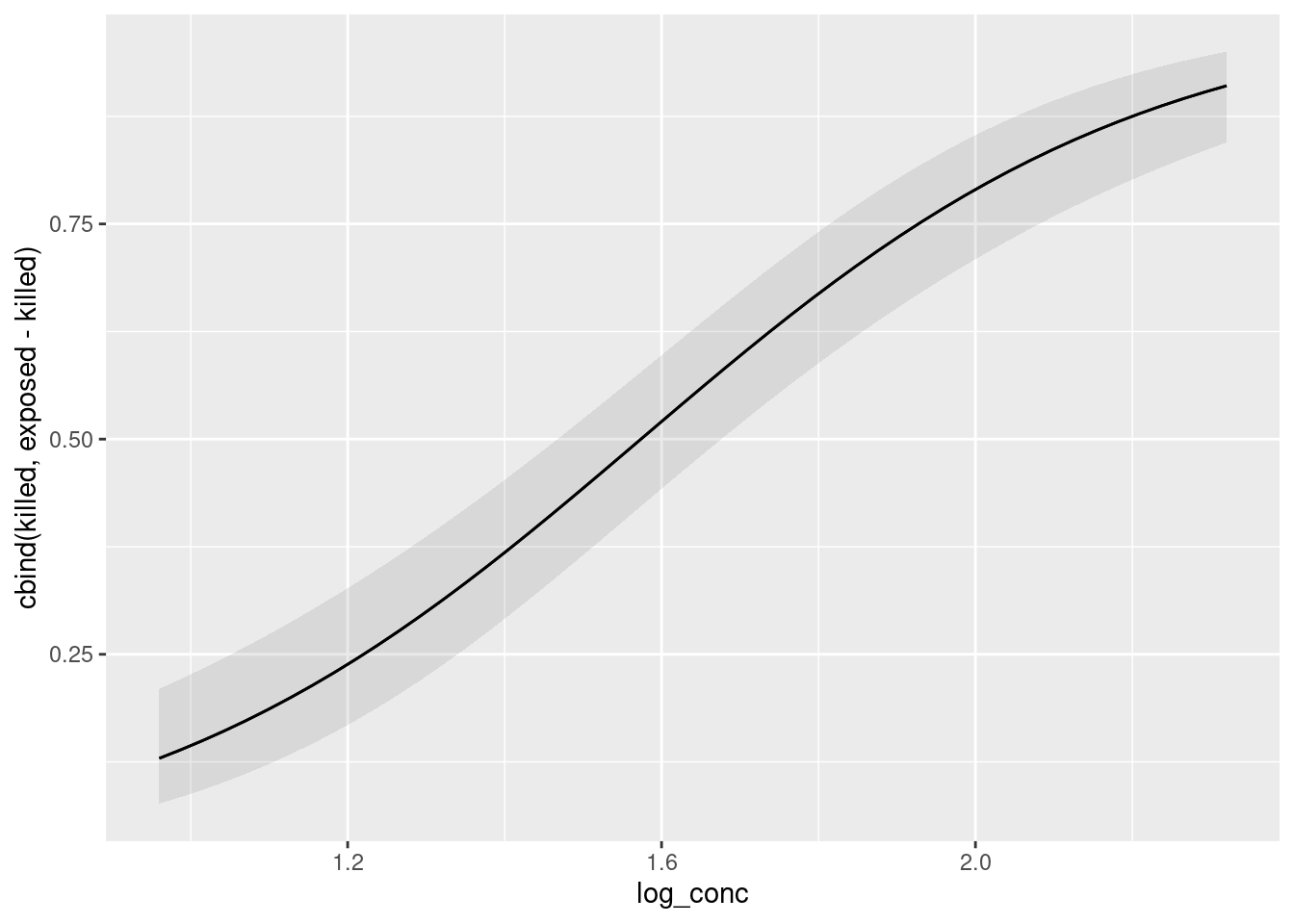
The thing I always forget is that the name of the explanatory variable has to be in quotes, which is not what we are used to from the tidyverse. The odd thing on the \(y\)-axis is our response variable; the predictions are the probability of being killed, which we could make our \(y\)-axis actually say, like this:
plot_predictions(model = bugs.1, condition = "log_conc") +
  labs(y = "Prob(killed)")
As the log-concentration goes up, you can see how clearly the probability of the aphid being killed goes up. The confidence band is narrow because there is lots of data (almost 250 aphids altogether), and the confidence interval is much higher at the end than at the beginning, which is why the P-value came out so tiny.
\(\blacksquare\)
- People in this kind of work are often interested in the “median lethal dose”. In this case, that would be the log-concentration of the insecticide that kills half the insects. Based on your predictions, roughly what do you think the median lethal dose is?
Solution
This is probably easier to see from the graph, though the \(x\)-scale doesn’t make it very easy to be accurate: look across to where the prediction crosses the probability of 0.5, which is somewhere between a log-concentration of 1.5 and 1.6.
If you go back and look at the predictions, the log-concentration of 1.63 is predicted to kill just over half the insects, so the median lethal dose should be a bit less than 1.63. It should not be as small as 1.33, though, since that log-concentration only kills less than a third of the insects. So I would guess somewhere a bit bigger than 1.5. Any guess somewhere in this ballpark is fine: you really cannot be very accurate.
Extra: this is kind of a strange prediction problem, because we know what the response variable should be, and we want to know what the explanatory variable’s value is. Normally we do predictions the other way around.4 So the only way to get a more accurate figure is to try some different log-concentrations, and see which one gets closest to a probability 0.5 of killing the insect.
Something like this would work:
new <- datagrid(model = bugs.1, log_conc = seq(1.5, 1.63, 0.01))
cbind(predictions(bugs.1, newdata = new))
The closest one of these to a probability of 0.5 is 0.4971, which goes with a log-concentration of 1.57: indeed, a bit bigger than 1.5 and a bit less than 1.63, and close to what I read off from my graph. The seq in the construction of the new data frame is “fill sequence”: go from 1.5 to 1.63 in steps of 0.01. We are predicting for values of log_conc that we chose, so the way to go is to make a new dataframe with datagrid and then feed that into predictions with newdata.
Now, of course this is only our “best guess”, like a single-number prediction in regression. There is uncertainty attached to it (because the actual logistic regression might be different from the one we estimated), so we ought to provide a confidence interval for it. But I’m riding the bus as I type this, so I can’t look it up right now.
Later: there’s a function called dose.p in MASS that appears to do this:
lethal <- dose.p(bugs.1)
lethal
Dose SE
p = 0.5: 1.573717 0.05159576We have a sensible point estimate (the same 1.57 that we got by hand), and we have a standard error, so we can make a confidence interval by going up and down twice it (or 1.96 times it) from the estimate. The structure of the result is a bit arcane, though:
str(lethal) 'glm.dose' Named num 1.57
- attr(*, "names")= chr "p = 0.5:"
- attr(*, "SE")= num [1, 1] 0.0516
..- attr(*, "dimnames")=List of 2
.. ..$ : chr "p = 0.5:"
.. ..$ : NULL
- attr(*, "p")= num 0.5It is what R calls a “vector with attributes”. To get at the pieces and calculate the interval, we have to do something like this:
(lethal_est <- as.numeric(lethal))[1] 1.573717(lethal_SE <- as.vector(attr(lethal, "SE")))[1] 0.05159576and then make the interval:
lethal_est + c(-2, 2) * lethal_SE[1] 1.470526 1.6769091.47 to 1.68.
I got this idea from page 4.14 of link. I think I got a little further than he did. An idea that works more generally is to get several intervals all at once, say for the “quartile lethal doses” as well:
lethal <- dose.p(bugs.1, p = c(0.25, 0.5, 0.75))
lethal
Dose SE
p = 0.25: 1.220327 0.07032465
p = 0.50: 1.573717 0.05159576
p = 0.75: 1.927108 0.06532356This looks like a data frame or matrix, but is actually a “named vector”, so enframe will get at least some of this and turn it into a genuine data frame:
enframe(lethal)That doesn’t get the SEs, so we’ll make a new column by grabbing the “attribute” as above:
enframe(lethal) %>% mutate(SE = attr(lethal, "SE"))and now we make the intervals by making new columns containing the lower and upper limits:
enframe(lethal) %>%
  mutate(SE = attr(lethal, "SE")) %>%
  mutate(LCL = value - 2 * SE, UCL = value + 2 * SE)
Now we have intervals for the median lethal dose, as well as for the doses that kill a quarter and three quarters of the aphids.
\(\blacksquare\)
27.13 The effects of Substance A
In a dose-response experiment, animals (or cell cultures or human subjects) are exposed to some toxic substance, and we observe how many of them show some sort of response. In this experiment, a mysterious Substance A is exposed at various doses to 100 cells at each dose, and the number of cells at each dose that suffer damage is recorded. The doses were 10, 20, … 70 (mg), and the number of damaged cells out of 100 were respectively 10, 28, 53, 77, 91, 98, 99.
- Find a way to get these data into R, and show that you have managed to do so successfully.
Solution
There’s not much data here, so we don’t need to create a file, although you can do so if you like (in the obvious way: type the doses and damaged cell numbers into a .txt file or spreadsheet and read in with the appropriate read_ function). Or, use a tribble:
dr <- tribble(
  ~dose, ~damaged,
  10, 10,
  20, 28,
  30, 53,
  40, 77,
  50, 91,
  60, 98,
  70, 99
)
dr
Or, make a data frame with the values typed in:
dr2 <- tibble(
  dose = seq(10, 70, 10),
  damaged = c(10, 28, 53, 77, 91, 98, 99)
)
dr2
seq fills a sequence “10 to 70 in steps of 10”, or you can just list the doses.
For these, find a way you like, and stick with it.
\(\blacksquare\)
- Would you expect to see a significant effect of dose for these data? Explain briefly.
Solution
The number of damaged cells goes up sharply as the dose goes up (from a very small number to almost all of them). So I’d expect to see a strongly significant effect of dose. This is far from something that would happen by chance.
\(\blacksquare\)
- Fit a logistic regression modelling the probability of a cell being damaged as it depends on dose. Display the results. (Comment on them is coming later.)
Solution
This has a bunch of observations at each dose (100 cells, in fact), so we need to do the two-column response thing: the successes in the first column and the failures in the second. This means that we need to calculate the number of cells at each dose that were not damaged, by subtracting the number that were damaged from 100. This is best done within the glm, so that everything is accessible to plot_predictions later.
Now we fit our model:
cells.1 <- glm(cbind(damaged, 100 - damaged) ~ dose, family = "binomial", data = dr)
summary(cells.1)
Call:
glm(formula = cbind(damaged, 100 - damaged) ~ dose, family = "binomial",
    data = dr)

Coefficients:
             Estimate Std. Error z value Pr(>|z|)
(Intercept) -3.275364   0.278479  -11.76   <2e-16 ***
dose         0.113323   0.008315   13.63   <2e-16 ***
---
Signif. codes:  0 '***' 0.001 '**' 0.01 '*' 0.05 '.' 0.1 ' ' 1

(Dispersion parameter for binomial family taken to be 1)

    Null deviance: 384.13349  on 6  degrees of freedom
Residual deviance:   0.50428  on 5  degrees of freedom
AIC: 31.725

Number of Fisher Scoring iterations: 4
The programmer in you is probably complaining “but, 100 is a number and damaged is a vector of 7 numbers. How does R know to subtract each one from 100?” Well, R has what’s known as “recycling rules”: if you try to add or subtract (or elementwise multiply or divide) two vectors of different lengths, it recycles the smaller one by repeating it until it’s as long as the longer one. So rather than 100-damaged giving an error, it does what you want.5
\(\blacksquare\)
- Does your output indicate that the probability of damage really does increase with dose? (There are two things here: is there really an effect, and which way does it go?)
Solution
The slope of dose is significantly nonzero (P-value less than \(2.2 \times 10^{-16}\), which is as small as it can be). The slope itself is positive, which means that as dose goes up, the probability of damage goes up.
That’s all I needed, but if you want to press on: the slope is 0.113, so an increase of 1 in dose goes with an increase of 0.113 in the log-odds of damage. Or it multiplies the odds of damage by \(\exp(0.113)\). Since 0.113 is small, this is about \(1.113\) (mathematically, \(e^x\simeq 1+x\) if \(x\) is small), so that the increase is about 11%. If you like, you can get a rough CI for the slope by going up and down twice its standard error (this is the usual approximately-normal thing). Here that would be
0.113323 + c(-2, 2) * 0.008315[1] 0.096693 0.129953I thought about doing that in my head, but thought better of it, since I have R just sitting here. The interval is short (we have lots of data) and definitely does not contain zero.
\(\blacksquare\)
- Obtain predicted damage probabilities for some representative doses.
Solution
Pick some representative doses first, and then use them as newdata. The ones in the original data are fine (there are only seven of them), but you can use some others if you prefer:
cbind(predictions(cells.1, newdata = dr)) %>%
  select(dose, damaged, estimate, conf.low, conf.high) -> p
p
I saved mine to use again later, but you don’t have to unless you want to use your predictions again later.
\(\blacksquare\)
- Draw a graph of the predicted probabilities, and to that add the observed proportions of damage at each dose. Hints: you will have to calculate the observed proportions first. Looking at the predicted probabilities, would you say that the model fits well? Explain briefly.
Solution
Because we used the cbind thing in our glm, we can start with plot_predictions as expected:
plot_predictions(cells.1, condition = "dose")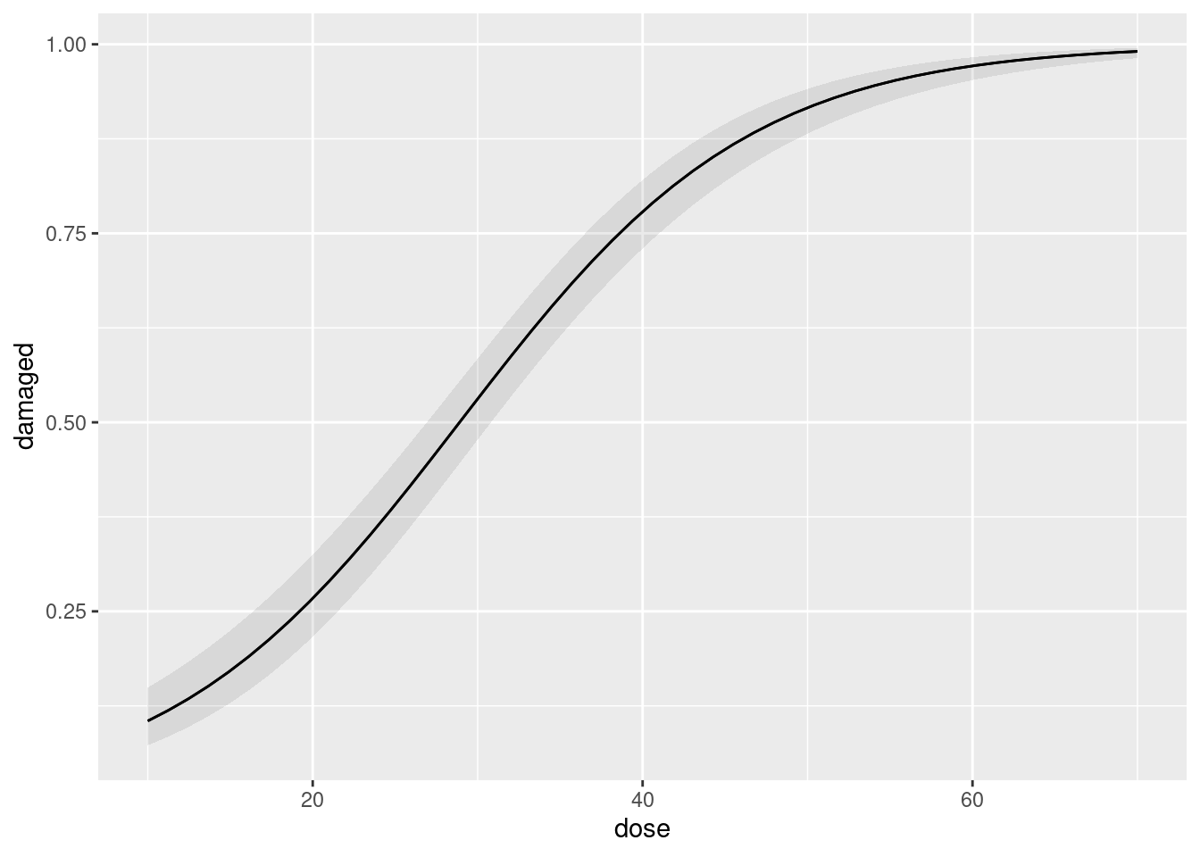
The predicted probability of a cell being damaged is very precisely estimated all the way up, and the probability is almost certainly very close to 1 for large doses.
Now, we need to figure out how to add the data to this graph. Let’s take a look at our original dataframe:
drTo that we need to add a column of proportion damaged, which is damaged divided by 100 (we know there were exactly 100 cells at each dose):
dr %>% mutate(prop = damaged / 100) -> dr2
dr2
Check. I saved this to add to the graph.
Now you can add this to the graph we made before with a geom_point with a data = and an aes, making the points red:
plot_predictions(cells.1, condition = "dose") +
  geom_point(data = dr2, aes(x = dose, y = prop), colour = "red")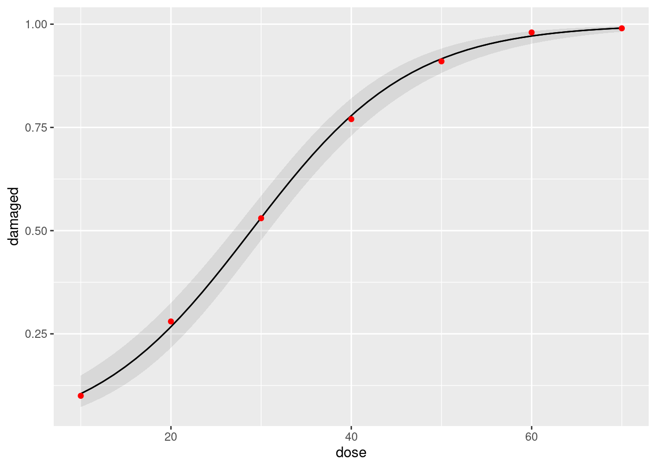
I also made the data points red (you don’t need to, but if you want to, put the colour outside the aes, to make it clear that the colour is constant, not determined by any of the variables in your dataframe).
The predicted probabilities ought to be close to the observed proportions. They are in fact very close to them, so the model fits very well indeed.
Your actual words are a judgement call, so precisely what you say doesn’t matter so much, but I think this model fit is actually closer than you could even hope to expect, it’s that good. But, your call. I think your answer ought to contain “close” or “fits well” at the very least.
\(\blacksquare\)
27.14 What makes an animal get infected?
Some animals got infected with a parasite. We are interested in whether the likelihood of infection depends on any of the age, weight and sex of the animals. The data are at link. The values are separated by tabs.
- Read in the data and take a look at the first few lines. Is this one animal per line, or are several animals with the same age, weight and sex (and infection status) combined onto one line? How can you tell?
Solution
The usual beginnings, bearing in mind the data layout:
my_url <- "http://ritsokiguess.site/datafiles/infection.txt"
infect <- read_tsv(my_url)
Rows: 81 Columns: 4
── Column specification ────────────────────────────────────────────────────────
Delimiter: "\t"
chr (2): infected, sex
dbl (2): age, weight
ℹ Use `spec()` to retrieve the full column specification for this data.
ℹ Specify the column types or set `show_col_types = FALSE` to quiet this message.infectSuccess. This appears to be one animal per line, since there is no indication of frequency (of “how many”). If you were working as a consultant with somebody’s data, this would be a good thing to confirm with them before you went any further.
You can check a few more lines to convince yourself and the story is much the same. The other hint is that you have actual categories of response, which usually indicates one individual per row, but not always. If it doesn’t, you have some extra work to do to bash it into the right format.
Extra: let’s see whether we can come up with an example of that. I’ll make a smaller example, and perhaps the place to start is “all possible combinations” of a few things. crossing is the same idea as datagrid, except that it doesn’t need a model, and so is better for building things from scratch:
d <- crossing(age = c(10, 12), gender = c("f", "m"), infected = c("y", "n"))
d
These might be one individual per row, or they might be more than one, as they would be if we have a column of frequencies:
d <- d %>% mutate(freq = c(12, 19, 17, 11, 18, 26, 16, 8))
d
Now, these are multiple observations per row (the presence of frequencies means there’s no doubt about that), but the format is wrong: infected is my response variable, and we want the frequencies of infected being y or n in separate columns — that is, we have to untidy the data a bit to make it suitable for modelling. This is pivot_wider, the opposite of pivot_longer:
d %>% pivot_wider(names_from=infected, values_from=freq) -> d1
d1
Now you can pull out the columns y and n and make them into your response, and predict that from age and gender:
response <- with(d1, cbind(y, n))
response
y n
[1,] 19 12
[2,] 11 17
[3,] 26 18
[4,] 8 16The moral of this story is that if you are going to have multiple observations per row, you probably want the combinations of explanatory variables one per row, but you want the categories of the response variable in separate columns.
Back to where we were the rest of the way.
\(\blacksquare\)
- * Make suitable plots or summaries of
infectedagainst each of the other variables. (You’ll have to think aboutsex, um, you’ll have to think about thesexvariable, because it too is categorical.) Anything sensible is OK here. You might like to think back to what we did in Question here for inspiration. (You can also investigatetable, which does cross-tabulations.)
Solution
What comes to my mind for the numerical variables age and weight is boxplots:
ggplot(infect, aes(x = infected, y = age)) + geom_boxplot()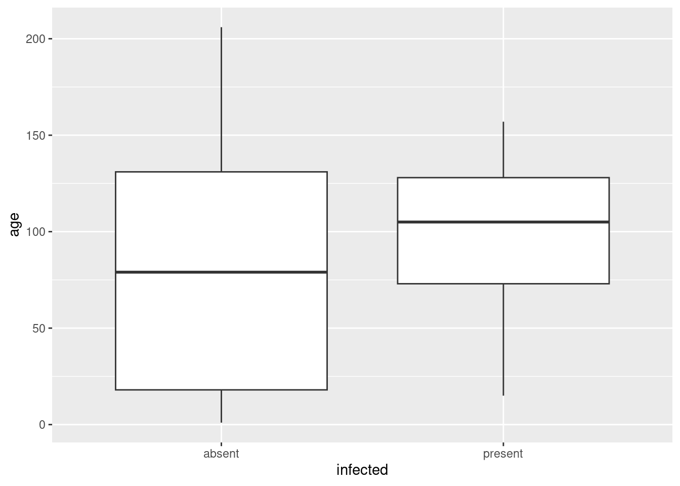
ggplot(infect, aes(x = infected, y = weight)) + geom_boxplot()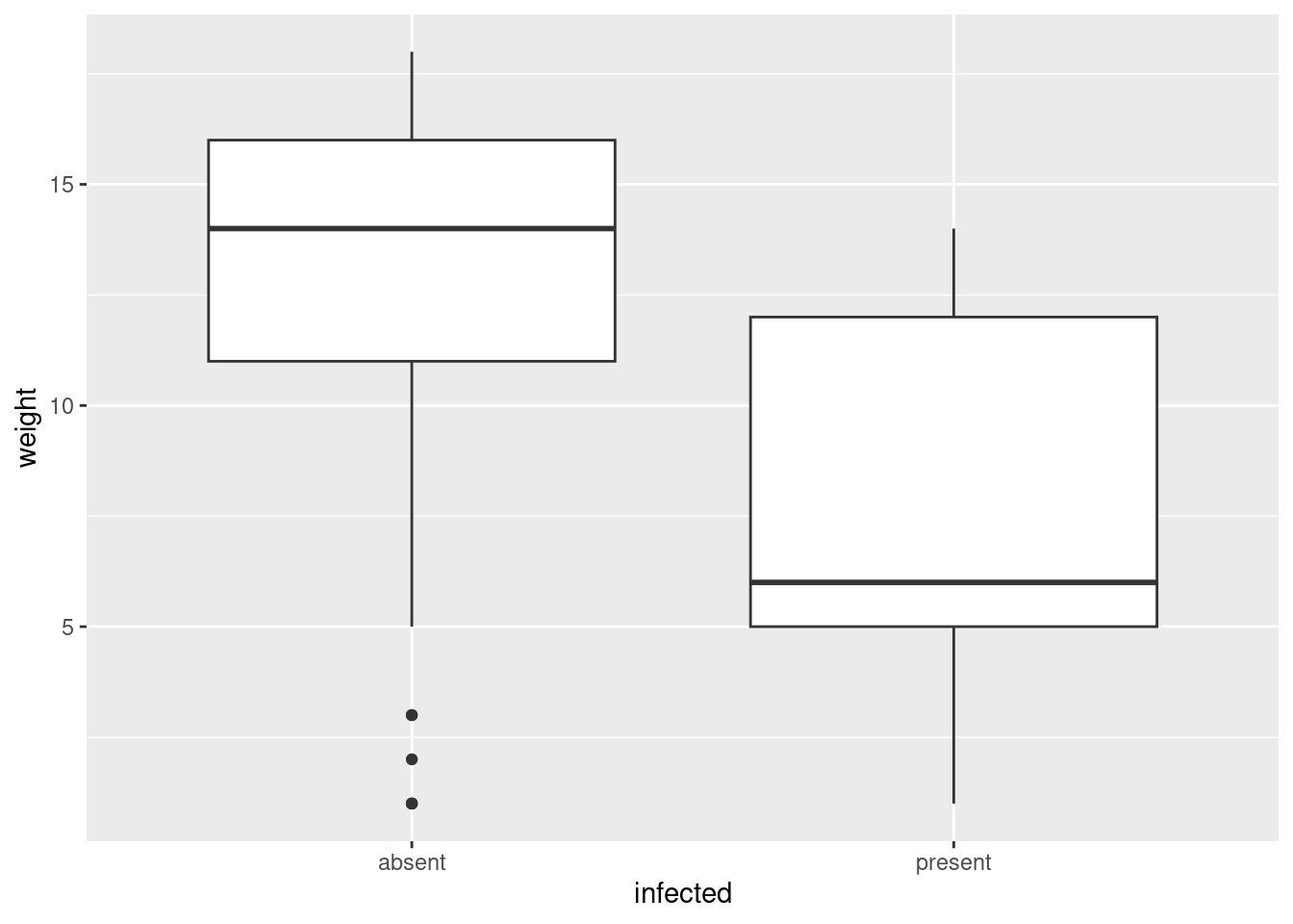
The variables sex and infected are both categorical. I guess a good plot for those would be some kind of grouped bar plot, which I have to think about. So let’s first try a numerical summary, a cross-tabulation, which is gotten via table:
with(infect, table(sex, infected)) infected
sex absent present
female 17 11
male 47 6Or, if you like the tidyverse:
infect %>% count(sex, infected)Now, bar plots. Let’s start with one variable. The basic bar plot has categories of a categorical variable along the \(x\)-axis and each bar is a count of how many observations were in that category. What is nice about geom_bar is that it will do the counting for you, so that the plot is just this:
ggplot(infect, aes(x = sex)) + geom_bar()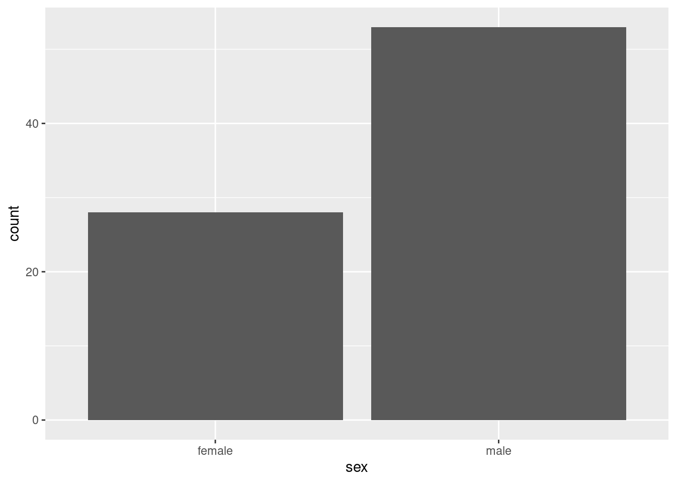
There are about twice as many males as females.
You may think that this looks like a histogram, which it almost does, but there is an important difference: the kind of variable on the \(x\)-axis. Here, it is a categorical variable, and you count how many observations fall in each category (at least, ggplot does). On a histogram, the \(x\)-axis variable is a continuous numerical one, like height or weight, and you have to chop it up into intervals (and then you count how many observations are in each chopped-up interval).
Technically, on a bar plot, the bars have a little gap between them (as here), whereas the histogram bars are right next to each other, because the right side of one histogram bar is the left side of the next.
All right, two categorical variables. The idea is that you have each bar divided into sub-bars based on the frequencies of a second variable, which is specified by fill. Here’s the basic idea:
ggplot(infect, aes(x = sex, fill = infected)) + geom_bar()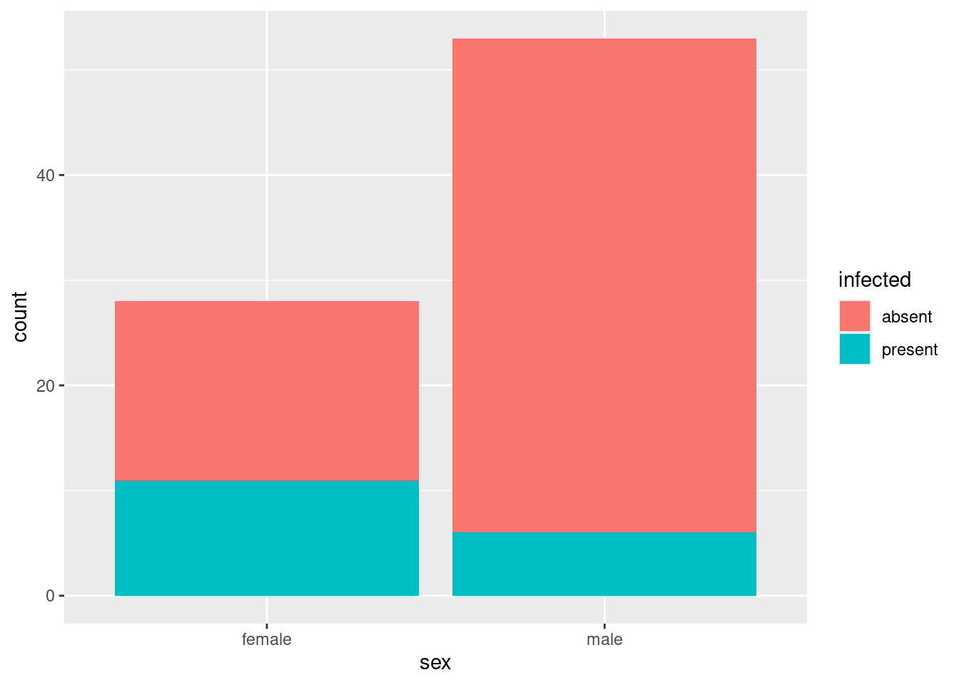
This is known in the business as a “stacked bar chart”. The issue is how much of each bar is blue, which is unnecessarily hard to judge because the male bar is taller. (Here, it is not so bad, because the amount of blue in the male bar is smaller and the bar is also taller. But we got lucky here.)
There are two ways to improve this. One is known as a “grouped bar chart”, which goes like this:
ggplot(infect, aes(x = sex, fill = infected)) +
  geom_bar(position = "dodge")
The absent and present frequencies for females are next to each other, and the same for males, and you can read off how big they are from the \(y\)-scale. This is my preferred graph for two (or more than two) categorical variables.
You could switch the roles of sex and infected and get a different chart, but one that conveys the same information. Try it. (The reason for doing it the way around I did is that being infected or not is the response and sex is explanatory, so that on my plot you can ask “out of the males, how many were infected?”, which is the way around that makes sense.)
The second way is to go back to stacked bars, but make them the same height, so you can compare the fractions of the bars that are each colour. This is position="fill":
ggplot(infect, aes(x = sex, fill = infected)) +
  geom_bar(position = "fill")
This also shows that more of the females were infected than the males, but without getting sidetracked into the issue that there were more males to begin with.
I wrote this question in early 2017. At that time, I wrote:
I learned about this one approximately two hours ago. I just ordered Hadley Wickham’s new book “R for Data Science” from Amazon, and it arrived today. It’s in there. (A good read, by the way. I’m thinking of using it as a recommended text next year.) As is so often the way with
ggplot, the final answer looks very simple, but there is a lot of thinking required to get there, and you end up having even more respect for Hadley Wickham for the clarity of thinking that enabled this to be specified in a simple way.
(end quote)
\(\blacksquare\)
- Which, if any, of your explanatory variables appear to be related to
infected? Explain briefly.
Solution
Let’s go through our output from (here). In terms of age, when infection is present, animals are (slightly) older. So there might be a small age effect. Next, when infection is present, weight is typically a lot less. So there ought to be a big weight effect. Finally, from the table, females are somewhere around 50-50 infected or not, but very few males are infected. So there ought to be a big sex effect as well. This also appears in the grouped bar plot, where the red (“absent”) bar for males is much taller than the blue (“present”) bar, but for females the two bars are almost the same height. So the story is that we would expect a significant effect of sex and weight, and maybe of age as well.
\(\blacksquare\)
- Fit a logistic regression predicting
infectedfrom the other three variables. Display thesummary.
Solution
Thus:
infect.1 <- glm(infected ~ age + weight + sex, family = "binomial", data = infect)Error in eval(family$initialize): y values must be 0 <= y <= 1Oh, I forgot to turn infected into a factor. This is the shortcut way to do that:
# infect
infect.1 <- glm(factor(infected) ~ age + weight + sex, family = "binomial", data = infect)
summary(infect.1)
Call:
glm(formula = factor(infected) ~ age + weight + sex, family = "binomial",
    data = infect)

Coefficients:
             Estimate Std. Error z value Pr(>|z|)
(Intercept)  0.609369   0.803288   0.759 0.448096
age          0.012653   0.006772   1.868 0.061701 .
weight      -0.227912   0.068599  -3.322 0.000893 ***
sexmale     -1.543444   0.685681  -2.251 0.024388 *
---
Signif. codes:  0 '***' 0.001 '**' 0.01 '*' 0.05 '.' 0.1 ' ' 1

(Dispersion parameter for binomial family taken to be 1)

    Null deviance: 83.234  on 80  degrees of freedom
Residual deviance: 59.859  on 77  degrees of freedom
AIC: 67.859

Number of Fisher Scoring iterations: 5drop1(infect.1, test = "Chisq")Or you could create a new or redefined column in the data frame containing the factor version of infected, for example in this way:
infect %>%
  mutate(infected = factor(infected)) %>%
  glm(infected ~ age + weight + sex, family = "binomial", data = .) -> infect.1a
summary(infect.1a)
Call:
glm(formula = infected ~ age + weight + sex, family = "binomial",
    data = .)

Coefficients:
             Estimate Std. Error z value Pr(>|z|)
(Intercept)  0.609369   0.803288   0.759 0.448096
age          0.012653   0.006772   1.868 0.061701 .
weight      -0.227912   0.068599  -3.322 0.000893 ***
sexmale     -1.543444   0.685681  -2.251 0.024388 *
---
Signif. codes:  0 '***' 0.001 '**' 0.01 '*' 0.05 '.' 0.1 ' ' 1

(Dispersion parameter for binomial family taken to be 1)

    Null deviance: 83.234  on 80  degrees of freedom
Residual deviance: 59.859  on 77  degrees of freedom
AIC: 67.859

Number of Fisher Scoring iterations: 5
Either way is good, and gives the same answer. The second way uses the data=. trick to ensure that the input data frame to glm is the output from the previous step, the one with the factor version of infected in it. The data=. is needed because glm requires a model formula first rather than a data frame (if the data were first, you could just omit it).
\(\blacksquare\)
- * Which variables, if any, would you consider removing from the model? Explain briefly.
Solution
This is the same idea as in multiple regression: look at the end of the line for each variable to get its individual P-value, and if that’s not small, you can take that variable out. age has a P-value of 0.062, which is (just) larger than 0.05, so we can consider removing this variable. The other two P-values, 0.00089 and 0.024, are definitely less than 0.05, so those variables should stay.
Alternatively, you can say that the P-value for age is small enough to be interesting, and therefore that age should stay. That’s fine, but then you need to be consistent in the next part.
You probably noted that sex is categorical. However, it has only the obvious two levels, and such a categorical variable can be assessed for significance this way. If you were worried about this, the right way to go is drop1:
drop1(infect.1, test = "Chisq")The P-values are similar, but not identical.6
I have to stop and think about this. There is a lot of theory that says there are several ways to do stuff in regression, but they are all identical. The theory doesn’t quite apply the same in generalized linear models (of which logistic regression is one): if you had an infinite sample size, the ways would all be identical, but in practice you’ll have a very finite amount of data, so they won’t agree.
I’m thinking about my aims here: I want to decide whether each \(x\)-variable should stay in the model, and for that I want a test that expresses whether the model fits significantly worse if I take it out. The result I get ought to be the same as physically removing it and comparing the models with anova, eg. for age:
infect.1b <- update(infect.1, . ~ . - age)
anova(infect.1b, infect.1, test = "Chisq")
This is the same thing as drop1 gives.
So, I think: use drop1 to assess whether anything should come out of a model like this, and use summary to obtain the slopes to interpret (in this kind of model, whether they’re positive or negative, and thus what kind of effect each explanatory variable has on the probability of whatever-it-is.)
\(\blacksquare\)
Solution
I think they are extremely consistent. When we looked at the plots, we said that weight and sex had large effects, and they came out definitely significant. There was a small difference in age between the infected and non-infected groups, and age came out borderline significant (with a P-value definitely larger than for the other variables, so that the evidence of its usefulness was weaker).
\(\blacksquare\)
- * The first and third quartiles of
ageare 26 and 130; the first and third quartiles ofweightare 9 and 16. Obtain predicted probabilities for all combinations of these andsex. (You’ll need to start by making a new data frame, usingdatagridto get all the combinations.)
Solution
Here’s how datagrid goes. Note my use of plural names to denote the things I want all combinations of:
ages <- c(26, 130)
weights <- c(9, 16)
sexes <- c("female", "male")
new <- datagrid(model = infect.1, age = ages, weight = weights, sex = sexes)
new
This is about on the upper end of what you would want to do just using the one line with datagrid in it and putting the actual values in instead of ages, weights etc. To my mind, once it gets longer than about this long, doing on one line starts to get unwieldy. But your taste might be different than mine.
Aside:
I could have asked you to include some more values of age and weight, for example the median as well, to get a clearer picture. But that would have made infect.new bigger, so I stopped here. (If we had been happy with five representative values of age and weight, we could have done predictions (below) with variables and not had to make new at all.)
datagrid makes a data frame from input vectors, so it doesn’t matter if those are different lengths. In fact, it’s also possible to make this data frame from things like quartiles stored in a data frame. To do that, you wrap the whole datagrid in a with:
d <- tibble(age = ages, weight = weights, sex = sexes)
d
new <- with(d, datagrid(model = infect.1, age=age, weight=weight, sex=sex))
newThis one is a little confusing because in eg. age = age, the first age refers to the column that will be in new, and the second one refers to the values that are going in there, namely the column called age in the dataframe d.7
End of aside.
Next, the predictions:
# predictions(infect.1, new)
cbind(predictions(infect.1, new)) %>%
  select(estimate, age:sex)
Extra: I didn’t ask you to comment on these, since the question is long enough already. But that’s not going to stop me!
These, in predicted, are predicted probabilities of infection.8
The way I remember the one-column-response thing is that the first level is the baseline (as it is in a regression with a categorical explanatory variable), and the second level is the one whose probability is modelled (in the same way that the second, third etc. levels of a categorical explanatory variable are the ones that appear in the summary table).
Let’s start with sex. The probabilities of a female being infected are all much higher than of a corresponding male (with the same age and weight) being infected. Compare, for example, lines 1 and 2. Or 3 and 4. Etc. So sex has a big effect.
What about weight? As weight goes from 9 to 16, with everything else the same, the predicted probability of infection goes sharply down. This is what we saw before: precisely, the boxplot showed us that infected animals were likely to be less heavy.
Last, age. As age goes up, the probabilities go (somewhat) up as well. Compare, for example, lines 1 and 5 or lines 4 and 8. I think this is a less dramatic change than for the other variables, but that’s a judgement call.
I got this example from (horrible URL warning) here: link It starts on page 275 in my edition. He goes at the analysis a different way, but he finishes with another issue that I want to show you.
Let’s work out the residuals and plot them against our quantitative explanatory variables. I think the best way to do this is augment from broom, to create a data frame containing the residuals alongside the original data:
library(broom)
infect.1a <- infect.1 %>% augment(infect)
infect.1a %>% as_tibble()ggplot(infect.1a, aes(x = weight, y = .resid)) + geom_point() +
geom_smooth()`geom_smooth()` using method = 'loess' and formula = 'y ~ x'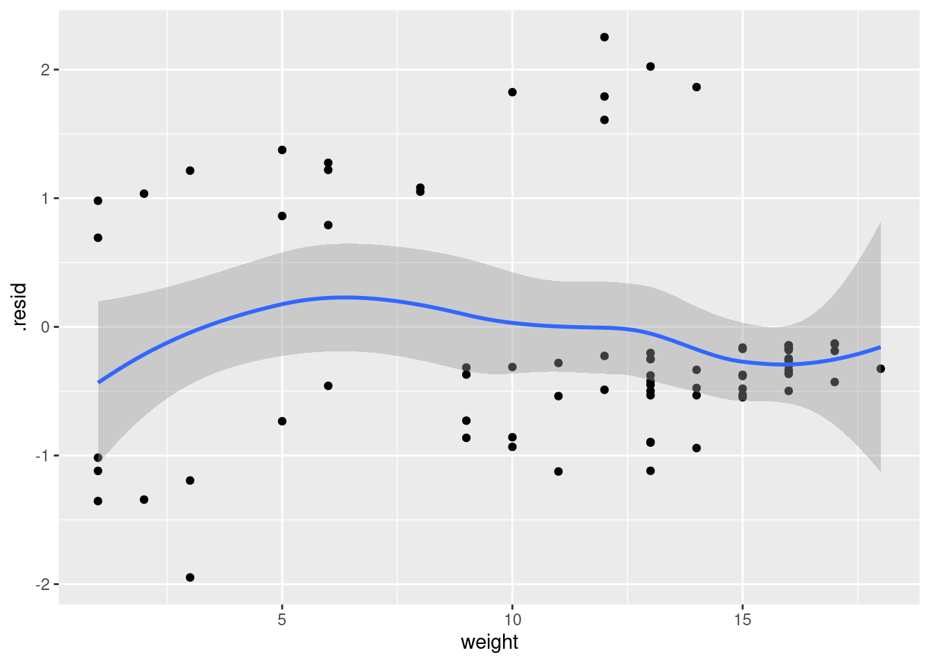
infect.1a is, I think, a genuine data.frame rather than a tibble.
I don’t quite know what to make of that plot. It doesn’t look quite random, and yet there are just some groups of points rather than any real kind of trend.
The corresponding plot with age goes the same way:
ggplot(infect.1a, aes(x = age, y = .resid)) + geom_point() +
  geom_smooth()
`geom_smooth()` using method = 'loess' and formula = 'y ~ x'
Crawley found the slightest suggestion of an up-and-down curve in there. I’m not sure I agree, but that’s what he saw. As with a regular regression, the residuals against anything should look random, with no trends. (Though the residuals from a logistic regression can be kind of odd, because the response variable can only be 1 or 0.) Crawley tries adding squared terms to the logistic regression, which goes like this. The glm statement is long, as they usually are, so it’s much easier to use update:
infect.2 <- update(infect.1, . ~ . + I(age^2) + I(weight^2))As we saw before, when thinking about what to keep, we want to look at drop1:
drop1(infect.2, test = "Chisq")The squared terms are both significant. The linear terms, age and weight, have to stay, regardless of their significance.9 What do the squared terms do to the predictions? Before, there was a clear one-directional trend in the relationships with age and weight. Has that changed? Let’s see. We’ll need a few more ages and weights to investigate with. I think the set of five representative values that comes out of predictions with variables would be ideal (and saves us having to make another new).
Let’s start by assessing the effect of age:
summary(infect) infected age weight sex
Length:81 Min. : 1.00 Min. : 1.00 Length:81
Class :character 1st Qu.: 26.00 1st Qu.: 9.00 Class :character
Mode :character Median : 87.00 Median :13.00 Mode :character
Mean : 83.65 Mean :11.49
3rd Qu.:130.00 3rd Qu.:16.00
Max. :206.00 Max. :18.00 new <- datagrid(model = infect.2, age = c(1, 26, 84, 130, 206))
newcbind(predictions(infect.2, newdata = new)) %>%
select(estimate, age, weight, sex)The actual values of age we chose are as shown. The other columns are constant; the values are the mean weight and the more common sex. We really can see the effect of age with all else constant.
Here, the predicted infection probabilities go up with age and then come down again, as a squared term in age will allow them to do, compared to what we had before:
cbind(predictions(infect.1, newdata = new)) %>%
select(estimate, age, weight, sex)where the probabilities keep on going up.
All right, what about the effect of weight? Here’s the first model:
new <- datagrid(model = infect.2, weight = c(1, 9, 13, 16, 18))
cbind(predictions(infect.1, newdata = new)) %>%
select(estimate, age, weight, sex)and here’s the second one with squared terms:
cbind(predictions(infect.2, newdata = new)) %>%
select(estimate, age, weight, sex)This one is not so dissimilar: in the linear model, the predicted probabilities of infection start high and go down, but in the model with squared terms they go slightly up before going down.
We couldn’t have a squared term in sex, since there are only two sexes (in this data set), so the predictions might be pretty similar for the two models:
new <- datagrid(model = infect.2, sex = c("female", "male"))
cbind(predictions(infect.1, newdata = new)) %>%
select(estimate, age, weight, sex)and
cbind(predictions(infect.2, newdata = new)) %>%
select(estimate, age, weight, sex)They are actually quite different. For the model with squared terms in age and weight, the predicted probabilities of infection are a lot higher for both males and females, at least at these (mean) ages and weights.
\(\blacksquare\)
27.15 The brain of a cat
A large number (315) of psychology students were asked to imagine that they were serving on a university ethics committee hearing a complaint against animal research being done by a member of the faculty. The students were told that the surgery consisted of implanting a device called a cannula in each cat’s brain, through which chemicals were introduced into the brain and the cats were then given psychological tests. At the end of the study, the cats’ brains were subjected to histological analysis. The complaint asked that the researcher’s authorization to carry out the study should be withdrawn, and the cats should be handed over to the animal rights group that filed the complaint. It was suggested that the research could just as well be done with computer simulations.
All of the psychology students in the survey were told all of this. In addition, they read a statement by the researcher that no animal felt much pain at any time, and that computer simulation was not an adequate substitute for animal research. Each student was also given one of the following scenarios that explained the benefit of the research:
“cosmetic”: testing the toxicity of chemicals to be used in new lines of hair care products.
“theory”: evaluating two competing theories about the function of a particular nucleus in the brain.
“meat”: testing a synthetic growth hormone said to potentially increase meat production.
“veterinary”: attempting to find a cure for a brain disease that is killing domesticated cats and endangered species of wild cats.
“medical”: evaluating a potential cure for a debilitating disease that afflicts many young adult humans.
Finally, each student completed two questionnaires: one that would assess their “relativism”: whether or not they believe in universal moral principles (low score) or whether they believed that the appropriate action depends on the person and situation (high score). The second questionnaire assessed “idealism”: a high score reflects a belief that ethical behaviour will always lead to good consequences (and thus that if a behaviour leads to any bad consequences at all, it is unethical).10
After being exposed to all of that, each student stated their decision about whether the research should continue or stop.
I should perhaps stress at this point that no actual cats were harmed in the collection of these data (which can be found as a .csv file at link). The variables in the data set are these:
decision: whether the research should continue or stop (response)idealism: score on idealism questionnairerelativism: score on relativism questionnairegenderof studentscenarioof research benefits that the student read.
A more detailed discussion11 of this study is at link.
- Read in the data and check by looking at the structure of your data frame that you have something sensible. Do not call your data frame
decision, since that’s the name of one of the variables in it.
Solution
So, like this, using the name decide in my case:
my_url <- "https://ritsokiguess.site/datafiles/decision.csv"
decide <- read_csv(my_url)
Rows: 315 Columns: 5
── Column specification ────────────────────────────────────────────────────────
Delimiter: ","
chr (3): decision, gender, scenario
dbl (2): idealism, relativism
ℹ Use `spec()` to retrieve the full column specification for this data.
ℹ Specify the column types or set `show_col_types = FALSE` to quiet this message.decideThe variables are all the right things and of the right types: the decision, gender and the scenario are all text (representing categorical variables), and idealism and relativism, which were scores on a test, are quantitative (numerical). There are, as promised, 315 observations.
\(\blacksquare\)
- Fit a logistic regression predicting
decisionfromgender. Is there an effect of gender?
Solution
Turn the response into a factor somehow, either by creating a new variable in the data frame or like this:
decide.1 <- glm(factor(decision) ~ gender, data = decide, family = "binomial")
summary(decide.1)
Call:
glm(formula = factor(decision) ~ gender, family = "binomial",
    data = decide)

Coefficients:
            Estimate Std. Error z value Pr(>|z|)
(Intercept)   0.8473     0.1543   5.491 3.99e-08 ***
genderMale   -1.2167     0.2445  -4.976 6.50e-07 ***
---
Signif. codes:  0 '***' 0.001 '**' 0.01 '*' 0.05 '.' 0.1 ' ' 1

(Dispersion parameter for binomial family taken to be 1)

    Null deviance: 425.57  on 314  degrees of freedom
Residual deviance: 399.91  on 313  degrees of freedom
AIC: 403.91

Number of Fisher Scoring iterations: 4
The P-value for gender is \(6.5 \times 10^{-7}\), which is very small, so there is definitely an effect of gender. It’s not immediately clear what kind of effect it is: that’s the reason for the next part, and we’ll revisit this slope coefficient in a moment. Categorical explanatory variables are perfectly all right as text. Should I have used drop1 to assess the significance? Maybe:
drop1(decide.1, test = "Chisq")The thing is, this gives us a P-value but not a slope, which we might have wanted to try to interpret. Also, the P-value in summary is so small that it is likely to be still significant in drop1 as well.
\(\blacksquare\)
- To investigate the effect (or non-effect) of
gender, create a contingency table by feedingdecisionandgenderintotable. What does this tell you?
Solution
with(decide, table(decision, gender)) gender
decision Female Male
continue 60 68
stop 140 47Females are more likely to say that the study should stop (a clear majority), while males are more evenly split, with a small majority in favour of the study continuing.
If you want the column percents as well, you can use prop.table. Two steps: save the table from above into a variable, then feed that into prop.table, calling for column percentages rather than row percentages:
tab <- with(decide, table(decision, gender))
prop.table(tab, 2)
gender
decision Female Male
continue 0.3000000 0.5913043
stop 0.7000000 0.4086957Why column percentages? Well, thinking back to STAB22 or some such place, when one of your variables is acting like a response or outcome (decision here), make the percentages out of the other one. Given that a student is a female, how likely are they to call for the research to stop? The other way around makes less sense: given that a person wanted the research to stop, how likely are they to be female?
About 70% of females and 40% of males want the research to stop. That’s a giant-sized difference. No wonder it was significant.
The other way of making the table is to use xtabs, with the same result:
xtabs(~ decision + gender, data = decide) gender
decision Female Male
continue 60 68
stop 140 47In this one, the frequency variable goes on the left side of the squiggle. We don’t have one here (each row of the data frame represents one student), so we leave the left side blank. I tried putting a . there, but that doesn’t work since there is no “whatever was there before” as there is, for example, in update.
As you’ll see later on with log-linear models, I now prefer making graphs with these. This is a grouped bar chart that we learned early in STAC32:
ggplot(decide, aes(x = gender, fill = decision)) + geom_bar(position = "fill")
I used position = "fill" because I wanted to compare proportions. This scales each bar to have height 1, no matter how many people it’s based on. As a result, you see that if you look at females, most of them think the research as described should stop, and a small majority of the males think it should continue. This is why we have a gender effect.
\(\blacksquare\)
- * Is your slope for
genderin the previous logistic regression positive or negative? Is it applying to males or to females? Looking at the conclusions from your contingency table, what probability does that mean your logistic regression is actually modelling?
Solution
My slope is \(-1.2167\), negative, and it is attached to males (note that the slope is called gendermale: because “female” is before “male” alphabetically, females are used as the baseline and this slope says how males compare to them). This negative male coefficient means that the probability of whatever is being modelled is less for males than it is for females. Looking at the contingency table for the last part, the probability of “stop” should be less for males, so the logistic regression is actually modelling the probability of “stop”. Another way to reason that this must be the right answer is that the two values of decision are continue and stop; continue is first alphabetically, so it’s the baseline, and the other one, stop, is the one whose probability is being modelled. That’s why I made you do that contingency table. Another way to think about this is to do a prediction, which would go like this:
new <- datagrid(model = decide.1, gender = levels(factor(decide$gender)))
newcbind(predictions(decide.1, newdata = new))Technical note: we could simply supply the two genders in the definition of new, remembering to type the Capital Letters. The other way is to find out which genders there are in the data, and one way is to temporarily turn gender into a factor and then find out which different values it has, which are called “levels”.
The probability of whatever-it-is is exactly 70% for females and about 40% for males. A quick look at the contingency table shows that exactly 70% (\(140/200\)) of the females think the research should stop, and a bit less than 50% of the males think the same thing. So the model is predicting the probability of “stop”.
There’s a logic to this: it’s not just this way “because it is”. It’s the same idea of the first category, now of the response factor, being a “baseline”, and what actually gets modelled is the second category, relative to the baseline.
\(\blacksquare\)
- Add the two variables
idealismandrelativismto your logistic regression. Do either or both of them add significantly to your model? Explain briefly.
Solution
The obvious way of doing this is to type out the entire model, with the two new variables on the end. You have to remember to turn decision into a factor again:
decide.2 <- glm(factor(decision) ~ gender + idealism + relativism,
  data = decide, family = "binomial"
)
summary(decide.2)
Call:
glm(formula = factor(decision) ~ gender + idealism + relativism,
    family = "binomial", data = decide)

Coefficients:
            Estimate Std. Error z value Pr(>|z|)
(Intercept)  -1.4876     0.9787  -1.520  0.12849
genderMale   -1.1710     0.2679  -4.372 1.23e-05 ***
idealism      0.6893     0.1115   6.180 6.41e-10 ***
relativism   -0.3432     0.1245  -2.757  0.00584 **
---
Signif. codes:  0 '***' 0.001 '**' 0.01 '*' 0.05 '.' 0.1 ' ' 1

(Dispersion parameter for binomial family taken to be 1)

    Null deviance: 425.57  on 314  degrees of freedom
Residual deviance: 346.50  on 311  degrees of freedom
AIC: 354.5

Number of Fisher Scoring iterations: 4
This is not so bad, copying and pasting. But the way I like better, when you’re making a smallish change to a longish model, is to use update:
decide.2 <- update(decide.1, . ~ . + idealism + relativism)
summary(decide.2)
Call:
glm(formula = factor(decision) ~ gender + idealism + relativism,
    family = "binomial", data = decide)

Coefficients:
            Estimate Std. Error z value Pr(>|z|)
(Intercept)  -1.4876     0.9787  -1.520  0.12849
genderMale   -1.1710     0.2679  -4.372 1.23e-05 ***
idealism      0.6893     0.1115   6.180 6.41e-10 ***
relativism   -0.3432     0.1245  -2.757  0.00584 **
---
Signif. codes:  0 '***' 0.001 '**' 0.01 '*' 0.05 '.' 0.1 ' ' 1

(Dispersion parameter for binomial family taken to be 1)

    Null deviance: 425.57  on 314  degrees of freedom
Residual deviance: 346.50  on 311  degrees of freedom
AIC: 354.5

Number of Fisher Scoring iterations: 4
Either way is good. The conclusion you need to draw is that they both have something to add, because their P-values are both less than 0.05.
Or (and perhaps better) you can look at drop1 of either of these:
drop1(decide.2, test = "Chisq")\(\blacksquare\)
- Add the variable
scenarioto your model. That is, fit a new model with that variable plus all the others.
Solution
To my mind, update wins hands down here:
decide.3 <- update(decide.2, . ~ . + scenario)You can display the summary here if you like, but we’re not going to look at it yet.
\(\blacksquare\)
- Use
anovato compare the models with and withoutscenario. You’ll have to add atest="Chisq"to youranova, to make sure that the test gets done. Doesscenariomake a difference or not, at \(\alpha=0.10\)? Explain briefly. (The reason we have to do it this way is thatscenariois a factor with five levels, so it has four slope coefficients. To test them all at once, which is what we need to make an overall test forscenario, this is the way it has to be done.)
Solution
These are the models that you fit in the last two parts:
anova(decide.2, decide.3, test = "Chisq")The P-value is not less than 0.05, but it is less than 0.10, which is what I implied to assess it with, so the scenario does make some kind of difference.
Extra: another way to do this, which I like better (but the anova way was what I asked in the original question), is to look at decide.3 and ask “what can I get rid of”, in such a way that categorical variables stay or go as a whole. This is done using drop1. It’s a little different from the corresponding thing in regression because the right way to do the test is not an F test, but now a chi-squared test (this is true for all generalized linear models of which logistic regression is one):
drop1(decide.3, test = "Chisq")The test for scenario has four degrees of freedom (since there are five scenarios), and is in fact exactly the same test as in anova, significant at \(\alpha=0.10\).
\(\blacksquare\)
- Look at the
summaryof your model that containedscenario. Bearing in mind that the slope coefficient forscenariocosmeticis zero (since this is the first scenario alphabetically), which scenarios have the most positive and most negative slope coefficients? What does that tell you about those scenarios’ effects?
Solution
All right. This is the model I called decide.3:
summary(decide.3)
Call:
glm(formula = factor(decision) ~ gender + idealism + relativism +
    scenario, family = "binomial", data = decide)

Coefficients:
                   Estimate Std. Error z value Pr(>|z|)
(Intercept)         -1.5694     1.0426  -1.505   0.1322
genderMale          -1.2551     0.2766  -4.537 5.70e-06 ***
idealism             0.7012     0.1139   6.156 7.48e-10 ***
relativism          -0.3264     0.1267  -2.576   0.0100 *
scenariomeat         0.1565     0.4283   0.365   0.7149
scenariomedical     -0.7095     0.4202  -1.688   0.0914 .
scenariotheory       0.4501     0.4271   1.054   0.2919
scenarioveterinary  -0.1672     0.4159  -0.402   0.6878
---
Signif. codes:  0 '***' 0.001 '**' 0.01 '*' 0.05 '.' 0.1 ' ' 1

(Dispersion parameter for binomial family taken to be 1)

    Null deviance: 425.57  on 314  degrees of freedom
Residual deviance: 338.06  on 307  degrees of freedom
AIC: 354.06

Number of Fisher Scoring iterations: 4
The most positive coefficient is for theory and the most negative one is for medical. (The zero coefficient is in the middle.) Since we are modelling the probability of saying that the research should stop (part (here)), this means that:
the “theory” scenario (evaluating theories about brain function) is most likely to lead to someone saying that the research should stop (other things being equal)
the “medical” scenario (finding a cure for a human disease) is most likely to lead to someone saying that the research should continue (or least likely to say that it should stop), again, other things being equal.
These make some kind of sense because being exposed to a scenario where there are tangible benefits later ought to be most favourable to the research continuing, and people are not going to be impressed by something that is “only theoretical” without any clear benefits.
We can also tackle this by doing some predictions. We want all the categories for scenario, and we might as well use average values for everything else:
new <- datagrid(model = decide.3, scenario = levels(factor(decide$scenario)))
newcbind(predictions(decide.3, newdata = new)) %>% select(estimate, gender, idealism, relativism, scenario)The scenarios are over on the right, and the values of the other variables are the same all the way down (means for the quantitative ones, the most common category for the categorical ones). Having checked that this is indeed the case, we really only need the predictions and the scenarios.
This echoes what we found before: the probability of saying that the research should stop is highest for “theory” and the lowest for “medical”.
I assumed in my model that the effect of the scenarios was the same for males and females. If I wanted to test that, I’d have to add an interaction and test that. This works most nicely using update and then anova, to fit the model with interaction and compare it with the model without:
decide.4 <- update(decide.3, . ~ . + gender * scenario)
anova(decide.3, decide.4, test = "Chisq")
No evidence at all that the scenarios have different effects for the different genders. The appropriate predictions should show that too:
new <- datagrid(model = decide.4,
                gender = levels(factor(decide$gender)),
                scenario = levels(factor(decide$scenario)))
cbind(predictions(decide.4, newdata = new)) %>% select(estimate, gender, idealism, relativism, scenario)
The predicted probabilities that the experiment should be stopped are a lot lower for males than females across the board (this is the strongly significant gender effect). But, given that, the probability for medical is the lowest for both males and females, and the probability for theory is the highest for females and almost the highest for males. (The pattern for males and females is similar enough to suggest that there should be no interaction.)
So fitting an interaction was a waste of time, but it was worth checking whether it was.
\(\blacksquare\)
- Describe the effects that having (i) a higher idealism score and (ii) a higher relativity score have on a person’s probability of saying that the research should stop. Do each of these increase or decrease that probability? Explain briefly.
Solution
Look back at the summary for the model that I called decide.3. (Or decide.2: the slope coefficients are very similar.) The one for idealism is positive, so that a higher idealism score goes with a greater likelihood of saying that the research should stop. The slope coefficient for relativity is negative, so it’s the other way around: a higher relativity score goes with a lower chance of saying that the research should stop.
That’s all I needed, but as an extra, we can look back at the description of these scales in the question.
The relativism one was that a person believed that the most moral action depends on the situation (as opposed to a person having something like religious faith that asserts universal moral principles that are always true. That would be a low score on the relativism scale). Somebody with a low score on this scale might believe something like “it is always wrong to experiment on animals”, whereas somebody with a high relativism score might say that it was sometimes justified. Thus, other things being equal, a low relativism score would go with “stop” and a high relativism score would (or might) go with “continue”. This would mean a negative slope coefficient for relativism, which is what we observed. (Are you still with me? There was some careful thinking there.)
What about idealism? This is a belief that ethical behaviour will always lead to good consequences, and thus, if the consequences are bad, the behaviour must not have been ethical. A person who scores high on idealism is likely to look at the consequences (experimentation on animals), see that as a bad thing, and thus conclude that the research should be stopped. The idealism slope coefficient, by that argument, should be positive, and is.
This can also be done by a prediction. In the light of what we have done before, the suggestion is this. Idealism and relativism are quantitative, so let’s grab their quartiles, giving us \(4 = 2 \times 2\) combinations:
new <- datagrid(model = decide.3,
                idealism = quantile(decide$idealism, c(0.25, 0.75)),
                relativism = quantile(decide$relativism, c(0.25, 0.75)))
newcbind(predictions(decide.3, newdata = new)) %>% select(estimate, gender, idealism, relativism, scenario)For both of the idealism scores, the higher relativism score went with a lower probability of “stop” (the “negative” effect), and for both of the relativism scores, the higher idealism score went with a higher probability of “stop” (the positive effect).
Yet another way to assess this would be to make a graph:
plot_predictions(decide.3, condition = c("relativism", "idealism"))
The story from here is the same: as relativism increases (move from left to right), the probability of stop decreases, but as idealism increases (from the red line up to the purple one), the probability of stop increases.
That’s quite enough discussion of the question, except that the data didn’t come to me in the form that you see them, so I figured I would like to share the story of the data processing as well. I think this is important because in your future work you are likely to spend a lot of your time getting data from how you receive it to something suitable for analysis.
These data came from a psychology study (with, probably, the students in a class serving as experimental subjects). Social scientists like to use SPSS software, so the data came to me as an SPSS .sav file.12 The least-fuss way of handling this that I could think of was to use import from the rio package, which I think I mentioned before:
library(rio)
x <- import("/home/ken/Downloads/Logistic.sav")
str(x)
'data.frame': 315 obs. of 11 variables:
$ decision : num 0 1 1 0 1 1 0 0 0 0 ...
..- attr(*, "format.spss")= chr "F1.0"
..- attr(*, "labels")= Named num [1:2] 0 1
.. ..- attr(*, "names")= chr [1:2] "stop" "continue"
$ idealism : num 8.2 6.8 8.2 7.4 1.7 5.6 7.2 7.8 7.8 8 ...
..- attr(*, "format.spss")= chr "F12.4"
$ relatvsm : num 5.1 5.3 6 6.2 3.1 7.7 6.7 4 4.7 7.6 ...
..- attr(*, "format.spss")= chr "F12.4"
$ gender : num 0 1 0 0 0 1 0 1 0 0 ...
..- attr(*, "format.spss")= chr "F1.0"
..- attr(*, "labels")= Named num [1:2] 0 1
.. ..- attr(*, "names")= chr [1:2] "Female" "Male"
$ cosmetic : num 1 1 1 1 1 1 1 1 1 1 ...
..- attr(*, "format.spss")= chr "F1.0"
$ theory : num 0 0 0 0 0 0 0 0 0 0 ...
..- attr(*, "format.spss")= chr "F1.0"
$ meat : num 0 0 0 0 0 0 0 0 0 0 ...
..- attr(*, "format.spss")= chr "F1.0"
$ veterin : num 0 0 0 0 0 0 0 0 0 0 ...
..- attr(*, "format.spss")= chr "F1.0"
$ idealism_LN: num 2.104 1.917 2.104 2.001 0.531 ...
..- attr(*, "format.spss")= chr "F8.2"
..- attr(*, "display_width")= int 13
$ relatvsm_LN: num 1.63 1.67 1.79 1.82 1.13 ...
..- attr(*, "format.spss")= chr "F8.2"
..- attr(*, "display_width")= int 13
$ scenario : num 1 1 1 1 1 1 1 1 1 1 ...
..- attr(*, "format.spss")= chr "F8.2"
..- attr(*, "display_width")= int 10The last line str displays the “structure” of the data frame that was obtained. Normally a data frame read into R has a much simpler structure than this, but this is R trying to interpret how SPSS does things. Here, each column (listed on the lines beginning with a dollar sign) has some values, listed after num; they are all numeric, even the categorical ones. What happened to the categorical variables is that they got turned into numbers, and they have a names “attribute” further down that says what those numbers actually represent. Thus, on the gender line, the subjects are a female (0), then a male (1), then three females, then a male, and so on. Variables like gender are thus so far neither really factors nor text variables, and so we’ll have to do a bit of processing before we can use them: we want to replace the numerical values by the appropriate “level”.
To turn a numeric variable into text depending on the value, we can use ifelse, but this gets unwieldy if there are more than two values to translate. For that kind of job, I think case_when is a lot easier to read. It also lets us have a catch-all for catching errors — “impossible” values occur distressingly often in real data:
xx <- x %>%
  mutate(
    decision = case_when(
      decision == 0 ~ "stop",
      decision == 1 ~ "continue",
      .default      = "error"
    ),
    gender = case_when(
      gender == 0 ~ "Female",
      gender == 1 ~ "Male",
      .default    = "error"
    ),
    scenario = case_when(
      scenario == 1 ~ "cosmetic",
      scenario == 2 ~ "theory",
      scenario == 3 ~ "meat",
      scenario == 4 ~ "veterinary",
      scenario == 5 ~ "medical",
      .default      = "error"
    )
  )
xx %>% as_tibble() %>% select(-(cosmetic:veterin))
xx is a “real” data.frame (that’s what rio reads in), and has some extra columns that we don’t want to see right now.
I have three new variables being created in one mutate. Each is being created using a case_when. The thing on the left of each squiggle is a logical condition being tested; the first of these logical conditions to come out TRUE provides the value for the new variable on the right of the squiggle. Thus, if the (old) scenario is 2, the new scenario will be theory. The TRUE lines in each case provide something that is guaranteed to be true, even if all the other lines are false (eg. if scenario is actually recorded as 7, which would be an error).
I overwrote the old variable values with the new ones, which is a bit risky, but then I’d have more things to get rid of later.
My next step is to check that I don’t actually have any errors:
xx %>% count(scenario, gender, decision)Don’t see any errors there.
So now let’s write what we have to a file. I think a .csv would be smart:
xx %>%
  select(decision, idealism, relatvsm, gender, scenario) %>%
  write_csv("decision.csv")
There is one more tiny detail: in SPSS, variable names can have a maximum of eight letters. “Relativism” has 10. So the original data file had the name “relativism” minus the two “i”s. I changed that so you would be dealing with a proper English word. (That change is not shown here.)
There is actually a town called Catbrain. It’s in England, near Bristol, and seems to be home to a street of car dealerships. One of the questions in the chapter on making maps asks you to find out where it is exactly.
\(\blacksquare\)
27.16 How not to get heart disease
What is associated with heart disease? In a study, a large number of variables were measured, as follows:
age(years)sexmale or femalepain.typeChest pain type (4 values: typical angina, atypical angina, non-anginal pain, asymptomatic)resting.bpResting blood pressure, on admission to hospitalserum.cholSerum cholesterolhigh.blood.sugar: greater than 120, yes or noelectroresting electrocardiographic results (normal, having ST-T, hypertrophy)max.hrMaximum heart rateanginaExercise induced angina (yes or no)oldpeakST depression induced by exercise relative to rest. See link.slopeSlope of peak exercise ST segment. Sloping up, flat or sloping downcolorednumber of major vessels (0–3) coloured by fluoroscopythalnormal, fixed defect, reversible defectheart.diseaseyes, no (response)
I don’t know what most of those are, but we will not let that stand in our way. Our aim is to find out what variables are associated with heart disease, and what values of those variables give high probabilities of heart disease being present. The data are in link.
- Read in the data. Display the first few lines and convince yourself that those values are reasonable.
Solution
A .csv file, so:
my_url <- "http://ritsokiguess.site/datafiles/heartf.csv"
heart <- read_csv(my_url)
New names:
Rows: 270 Columns: 15
── Column specification
──────────────────────────────────────────────────────── Delimiter: "," chr
(8): sex, pain.type, high.blood.sugar, electro, angina, slope, thal, hea... dbl
(7): ...1, age, resting.bp, serum.chol, max.hr, oldpeak, colored
ℹ Use `spec()` to retrieve the full column specification for this data. ℹ
Specify the column types or set `show_col_types = FALSE` to quiet this message.
• `` -> `...1`heartYou should check that the variables that should be numbers actually are, that the variables that should be categorical have (as far as is shown) the right values as per my description above, and you should make some comment in that direction.
My variables appear to be correct, apart possibly for that variable X1 which is actually just the row number.
\(\blacksquare\)
- In a logistic regression, what probability will be predicted here? Explain briefly but convincingly. (Is each line of the data file one observation or a summary of several?)
Solution
Each line of the data file is a single observation, not frequencies of yes and no (like the premature babies question, later, is). The response variable is a factor, so the first level is the baseline and the second level is the one predicted. R puts factor levels alphabetically, so no is first and yes is second. That is, a logistic regression will predict the probability that a person does have heart disease. I want to see that logic (which is why I said “convincingly”): one observation per line, and therefore that the second level of the factor is predicted, which is yes.
\(\blacksquare\)
- * Fit a logistic regression predicting heart disease from everything else (if you have a column called
XorX1, ignore that), and display the results.
Solution
A lot of typing, since there are so many variables. Don’t forget that the response variable must be a factor:
heart.1 <- glm(factor(heart.disease) ~ age + sex + pain.type + resting.bp + serum.chol +
  high.blood.sugar + electro + max.hr + angina + oldpeak + slope + colored + thal,
family = "binomial", data = heart
)
You can split this over several lines (and probably should), but make sure to end each line in such a way that there is unambiguously more to come, for example with a plus or a comma (though probably the fact that you have an unclosed bracket will be enough).
The output is rather lengthy:
summary(heart.1)
Call:
glm(formula = factor(heart.disease) ~ age + sex + pain.type +
    resting.bp + serum.chol + high.blood.sugar + electro + max.hr +
    angina + oldpeak + slope + colored + thal, family = "binomial",
    data = heart)

Coefficients:
                     Estimate Std. Error z value Pr(>|z|)
(Intercept)         -3.973837   3.133311  -1.268 0.204707
age                 -0.016007   0.026394  -0.606 0.544208
sexmale              1.763012   0.580761   3.036 0.002400 **
pain.typeatypical   -0.997298   0.626233  -1.593 0.111264
pain.typenonanginal -1.833394   0.520808  -3.520 0.000431 ***
pain.typetypical    -2.386128   0.756538  -3.154 0.001610 **
resting.bp           0.026004   0.012080   2.153 0.031346 *
serum.chol           0.006621   0.004228   1.566 0.117322
high.blood.sugaryes -0.370040   0.626396  -0.591 0.554692
electronormal       -0.633593   0.412073  -1.538 0.124153
electroSTT           0.013986   3.184512   0.004 0.996496
max.hr              -0.019337   0.011486  -1.683 0.092278 .
anginayes            0.596869   0.460540   1.296 0.194968
oldpeak              0.449245   0.244631   1.836 0.066295 .
slopeflat            0.827054   0.966139   0.856 0.391975
slopeupsloping      -0.122787   1.041666  -0.118 0.906166
colored              1.199839   0.280947   4.271 1.95e-05 ***
thalnormal           0.146197   0.845517   0.173 0.862723
thalreversible       1.577988   0.838550   1.882 0.059863 .
---
Signif. codes:  0 '***' 0.001 '**' 0.01 '*' 0.05 '.' 0.1 ' ' 1

(Dispersion parameter for binomial family taken to be 1)

    Null deviance: 370.96  on 269  degrees of freedom
Residual deviance: 168.90  on 251  degrees of freedom
AIC: 206.9

Number of Fisher Scoring iterations: 6
I didn’t ask you for further comment, but note that quite a lot of these variables are factors, so you get slopes for things like pain.typeatypical. When you have a factor in a model, there is a slope for each level except for the first, which is a baseline (and its slope is taken to be zero). That would be asymptomatic for pain.type. The \(t\)-tests for the other levels of pain.type say whether that level of pain type differs significantly (in terms of probability of heart disease) from the baseline level. Here, pain type atypical is not significantly different from the baseline, but the other two pain types, nonanginal and typical, are significantly different. If you think about this from an ANOVA-like point of view, the question about pain.type’s significance is really “is there at least one of the pain types that is different from the others”, and if we’re thinking about whether we should keep pain.type in the logistic regression, this is the kind of question we should be thinking about.
\(\blacksquare\)
- Quite a lot of our explanatory variables are factors. To assess whether the factor as a whole should stay or can be removed, looking at the slopes won’t help us very much (since they tell us whether the other levels of the factor differ from the baseline, which may not be a sensible comparison to make). To assess which variables are candidates to be removed, factors included (properly), we can use
drop1. Feeddrop1a fitted model and the wordstest="Chisq"(take care of the capitalization!) and you’ll get a list of P-values. Which variable is the one that you would remove first? Explain briefly.
Solution
Following the instructions:
drop1(heart.1, test = "Chisq")The highest P-value, 0.5525, goes with high.blood.sugar, so this one comes out first. (The P-value for age is almost as high, 0.5427, so you might guess that this will be next.)
You might be curious about how these compare with the P-values on summary. These two P-values are almost the same as the ones on summary, because they are a two-level factor and a numeric variable respectively, and so the tests are equivalent in the two cases. (The P-values are not identical because the tests on summary and drop1 are the kind of thing that would be identical on a regular regression but are only “asymptotically the same” in logistic regression, so you’d expect them to be close without being the same, as here. “Asymptotically the same” means that if you had an infinitely large sample size, they’d be identical, but our sample size of 200-odd individuals is not infinitely large! Anyway, the largest P-value on the summary is 0.9965, which goes with electroSTT. electro, though, is a factor with three levels; this P-value says that STT is almost identical (in its effects on heart disease) with the baseline hypertrophy. But there is a third level, normal, which is a bit different from hypertrophy. So the factor electro overall has some effect on heart disease, which is reflected in the drop1 P-value of 0.12: this might go later, but it has to stay for now because at least one of its levels is different from the others in its effect on heart disease. (In backward elimination, multi-level factors are removed in their entirety if none of their levels have a different effect from any of the others.)
The power just went out here, so I am using my laptop on battery on its own screen, rather than on the big screen I have in my office, which is much better.
\(\blacksquare\)
- I’m not going to make you do the whole backward elimination (I’m going to have you use
stepfor that later), but do one step: that is, fit a model removing the variable you think should be removed, usingupdate, and then rundrop1again to see which variable will be removed next.
Solution
update is the obvious choice here, since we’re making a small change to a very big model:
heart.2 <- update(heart.1, . ~ . - high.blood.sugar)
drop1(heart.2, test = "Chisq")
The power is back.
The next variable to go is indeed age, with a P-value that has hardly changed: it is now 0.5218.
\(\blacksquare\)
- Use
stepto do a backward elimination to find which variables have an effect on heart disease. Display your final model (which you can do by saving the output fromstepin a variable, and asking for the summary of that. Instep, you’ll need to specify a starting model (the one from part (here)), the direction of elimination, and the test to display the P-value for (the same one as you used indrop1). (Note: the actual decision to keep or drop explanatory variables is based on AIC rather than the P-value, with the result thatstepwill sometimes keep variables you would have dropped, with P-values around 0.10.)
Solution
The hints ought to lead you to this:
heart.3 <- step(heart.1, direction = "backward", test = "Chisq")Start: AIC=206.9
factor(heart.disease) ~ age + sex + pain.type + resting.bp +
serum.chol + high.blood.sugar + electro + max.hr + angina +
oldpeak + slope + colored + thal
Df Deviance AIC LRT Pr(>Chi)
- high.blood.sugar 1 169.25 205.25 0.3528 0.5525052
- age 1 169.27 205.27 0.3705 0.5427474
- electro 2 171.31 205.31 2.4119 0.2994126
- angina 1 170.55 206.55 1.6562 0.1981121
<none> 168.90 206.90
- slope 2 172.98 206.98 4.0844 0.1297422
- serum.chol 1 171.34 207.34 2.4484 0.1176468
- max.hr 1 171.84 207.84 2.9391 0.0864608 .
- oldpeak 1 172.44 208.44 3.5449 0.0597303 .
- resting.bp 1 173.78 209.78 4.8793 0.0271810 *
- thal 2 180.78 214.78 11.8809 0.0026308 **
- sex 1 179.16 215.16 10.2684 0.0013533 **
- pain.type 3 187.85 219.85 18.9557 0.0002792 ***
- colored 1 191.78 227.78 22.8878 1.717e-06 ***
---
Signif. codes: 0 '***' 0.001 '**' 0.01 '*' 0.05 '.' 0.1 ' ' 1
Step: AIC=205.25
factor(heart.disease) ~ age + sex + pain.type + resting.bp +
serum.chol + electro + max.hr + angina + oldpeak + slope +
colored + thal
Df Deviance AIC LRT Pr(>Chi)
- electro 2 171.65 203.65 2.3963 0.301750
- age 1 169.66 203.66 0.4104 0.521756
- angina 1 170.78 204.78 1.5323 0.215764
- slope 2 173.18 205.18 3.9288 0.140240
<none> 169.25 205.25
- serum.chol 1 171.69 205.69 2.4458 0.117841
- max.hr 1 172.35 206.35 3.0969 0.078440 .
- oldpeak 1 173.26 207.26 4.0094 0.045248 *
- resting.bp 1 173.84 207.84 4.5942 0.032080 *
- sex 1 179.27 213.27 10.0229 0.001546 **
- thal 2 181.61 213.61 12.3588 0.002072 **
- pain.type 3 190.54 220.54 21.2943 9.145e-05 ***
- colored 1 191.87 225.87 22.6232 1.971e-06 ***
---
Signif. codes: 0 '***' 0.001 '**' 0.01 '*' 0.05 '.' 0.1 ' ' 1
Step: AIC=203.65
factor(heart.disease) ~ age + sex + pain.type + resting.bp +
serum.chol + max.hr + angina + oldpeak + slope + colored +
thal
Df Deviance AIC LRT Pr(>Chi)
- age 1 172.03 202.03 0.3894 0.5326108
- angina 1 173.13 203.13 1.4843 0.2231042
<none> 171.65 203.65
- slope 2 175.99 203.99 4.3442 0.1139366
- max.hr 1 175.00 205.00 3.3560 0.0669599 .
- serum.chol 1 175.11 205.11 3.4610 0.0628319 .
- oldpeak 1 175.42 205.42 3.7710 0.0521485 .
- resting.bp 1 176.61 206.61 4.9639 0.0258824 *
- thal 2 182.91 210.91 11.2633 0.0035826 **
- sex 1 182.77 212.77 11.1221 0.0008531 ***
- pain.type 3 192.83 218.83 21.1859 9.632e-05 ***
- colored 1 194.90 224.90 23.2530 1.420e-06 ***
---
Signif. codes: 0 '***' 0.001 '**' 0.01 '*' 0.05 '.' 0.1 ' ' 1
Step: AIC=202.03
factor(heart.disease) ~ sex + pain.type + resting.bp + serum.chol +
max.hr + angina + oldpeak + slope + colored + thal
Df Deviance AIC LRT Pr(>Chi)
- angina 1 173.57 201.57 1.5385 0.2148451
<none> 172.03 202.03
- slope 2 176.33 202.33 4.2934 0.1168678
- max.hr 1 175.00 203.00 2.9696 0.0848415 .
- serum.chol 1 175.22 203.22 3.1865 0.0742492 .
- oldpeak 1 175.92 203.92 3.8856 0.0487018 *
- resting.bp 1 176.63 204.63 4.5911 0.0321391 *
- thal 2 183.38 209.38 11.3500 0.0034306 **
- sex 1 183.97 211.97 11.9388 0.0005498 ***
- pain.type 3 193.71 217.71 21.6786 7.609e-05 ***
- colored 1 195.73 223.73 23.6997 1.126e-06 ***
---
Signif. codes: 0 '***' 0.001 '**' 0.01 '*' 0.05 '.' 0.1 ' ' 1
Step: AIC=201.57
factor(heart.disease) ~ sex + pain.type + resting.bp + serum.chol +
max.hr + oldpeak + slope + colored + thal
Df Deviance AIC LRT Pr(>Chi)
<none> 173.57 201.57
- slope 2 178.44 202.44 4.8672 0.0877201 .
- serum.chol 1 176.83 202.83 3.2557 0.0711768 .
- max.hr 1 177.52 203.52 3.9442 0.0470322 *
- oldpeak 1 177.79 203.79 4.2135 0.0401045 *
- resting.bp 1 178.56 204.56 4.9828 0.0256006 *
- thal 2 186.22 210.22 12.6423 0.0017978 **
- sex 1 185.88 211.88 12.3088 0.0004508 ***
- pain.type 3 200.68 222.68 27.1025 5.603e-06 ***
- colored 1 196.98 222.98 23.4109 1.308e-06 ***
---
Signif. codes: 0 '***' 0.001 '**' 0.01 '*' 0.05 '.' 0.1 ' ' 1The output is very long. In terms of AIC, which is what step uses, age hangs on for a bit, but eventually gets eliminated.
There are a lot of variables left.
\(\blacksquare\)
- Display the summary of the model that came out of
step.
Solution
This:
summary(heart.3)
Call:
glm(formula = factor(heart.disease) ~ sex + pain.type + resting.bp +
    serum.chol + max.hr + oldpeak + slope + colored + thal, family = "binomial",
    data = heart)

Coefficients:
                     Estimate Std. Error z value Pr(>|z|)
(Intercept)         -4.818418   2.550437  -1.889 0.058858 .
sexmale              1.850559   0.561583   3.295 0.000983 ***
pain.typeatypical   -1.268233   0.604488  -2.098 0.035903 *
pain.typenonanginal -2.086204   0.486591  -4.287 1.81e-05 ***
pain.typetypical    -2.532340   0.748941  -3.381 0.000722 ***
resting.bp           0.024125   0.011077   2.178 0.029410 *
serum.chol           0.007142   0.003941   1.812 0.069966 .
max.hr              -0.020373   0.010585  -1.925 0.054262 .
oldpeak              0.467028   0.233280   2.002 0.045284 *
slopeflat            0.859564   0.922749   0.932 0.351582
slopeupsloping      -0.165832   0.991474  -0.167 0.867167
colored              1.134561   0.261547   4.338 1.44e-05 ***
thalnormal           0.323543   0.813442   0.398 0.690818
thalreversible       1.700314   0.805127   2.112 0.034699 *
---
Signif. codes:  0 '***' 0.001 '**' 0.01 '*' 0.05 '.' 0.1 ' ' 1

(Dispersion parameter for binomial family taken to be 1)

    Null deviance: 370.96  on 269  degrees of freedom
Residual deviance: 173.57  on 256  degrees of freedom
AIC: 201.57

Number of Fisher Scoring iterations: 6
Not all of the P-values in the step output wound up being less than 0.05, but they are all at least reasonably small. As discussed above, some of the P-values in the summary are definitely not small, but they go with factors where there are significant effects somewhere. For example, thalnormal is not significant (that is, normal is not significantly different from the baseline fixed), but the other level reversible is different from fixed. You might be wondering about slope: on the summary there is nothing close to significance, but on the step output, slope has at least a reasonably small P-value of 0.088. This is because the significant difference does not involve the baseline: it’s actually between flat with a positive slope and upsloping with a negative one.
\(\blacksquare\)
- We are going to make a large number of predictions. Create and save a data frame that contains predictions for all combinations of representative values for all the variables in the model that came out of
step. By “representative” I mean all the values for a categorical variable, and the five-number summary for a numeric variable. (Note that you will get a lot of predictions.)
Solution
The hard work is in listing all the variables. The easiest way to make sure you have them all is to look at the summary of your best model (mine was called heart.3) first, and copy them from the Call at the top. This is easier than looking at the table of Coefficients (or tidy output) because for categorical variables like pain.type you will have to distinguish the name of the variable from its levels. For example, the table of Coefficients has pain.typeatypical and pain.typenonanginal. Is it obvious to you where the variable name ends and its level begins?13
All right, let’s set up our dataframe to predict from. This needs the five-number summary of quantitative variables (via quantile), and the levels of the categorical ones (via levels(factor())). Take a deep breath and begin:
new <- datagrid(model = heart.3,
                sex = levels(factor(heart$sex)),
                pain.type = levels(factor(heart$pain.type)),
                resting.bp = quantile(heart$resting.bp),
                serum.chol = quantile(heart$serum.chol),
                max.hr = quantile(heart$max.hr),
                oldpeak = quantile(heart$oldpeak),
                slope = levels(factor(heart$slope)),
                colored = quantile(heart$colored),
                thal = levels(factor(heart$thal)))
new
p <- cbind(predictions(heart.3, newdata = new))
pThere are a mere 108,000 rows here (and a fair few columns also). That is fine — as long as you don’t display them all for a grader to have to page through!
\(\blacksquare\)
- Find the largest predicted probability (which is the predicted probability of heart disease) and display all the variables that it was a prediction for.
Solution
The (at current writing) approved way to do this is to use slice_max. This finds the rows with maximum value(s) on a variable, which is exactly what we want. It goes like this:
p %>% slice_max(estimate, n = 1)The inputs to slice_max are the column whose maximum value you want, and the number of rows you want (so n = 3 would display the three rows with the highest predicted probabilities).
Variations:
- by using
propinstead ofn, you can display theproportionof rows with the highest values on your variable, such as the 10% of rows with the highest predicted probabilities withprop = 0.10 - there is also
slice_minthat displays the rows with the lowest values on a variable, or the input proportion of rows with the lowest values - there are alse
slice_headandslice_tailthat display the first and last (respectively) rows in a dataframe. The default display of a dataframe in a Quarto document is thus
p %>% slice_head(n = 10)except that the default display also tells you how many rows there are altogether.
- you may have run into
slice_sample, which displays a randomly-chosen number or proportion of rows from a dataframe. This is useful after you read in a dataframe from a file, if you want to get a sense of what kind of values you have in your dataframe (for example, if they are ordered by something and looking at the first ten rows won’t tell you the whole story, such as having males listed first and you want to check that there are some females as well):
p %>% slice_sample(n = 10)If you didn’t think of slice_max, there are lots of other ways. Find one. Here are some examples:
p %>% filter(estimate == max(estimate))or if you didn’t think of that, you can find the maximum first, and then display the rows with predictions close to it:
p %>% summarize(m = max(estimate))p %>% filter(estimate > 0.999998)or even find which row has the maximum, and then display that row:
p %>% summarize(row = which.max(estimate))p %>% slice(67059)or sort the rows by estimate, descending, and display the top few:
p %>% arrange(desc(estimate)) %>% slice(1:8)\(\blacksquare\)
- Compare the
summaryof the final model fromstepwith your highest predicted heart disease probability and the values of the other variables that make it up. Are they consistent?
Solution
Since we were predicting the probability of heart disease, a more positive slope in the model from step will be associated with a higher probability of heart disease. So, there, we are looking for a couple of things: if the variable is a factor, we’re looking for the level with the most positive slope (bearing in mind that this might be the baseline), and for a numeric variable, if the slope is positive, a high value is associated with heart disease, and if negative, a low value. Bearing that in mind, we go back to my summary(heart.3):
summary(heart.3)
Call:
glm(formula = factor(heart.disease) ~ sex + pain.type + resting.bp +
    serum.chol + max.hr + oldpeak + slope + colored + thal, family = "binomial",
    data = heart)

Coefficients:
                     Estimate Std. Error z value Pr(>|z|)
(Intercept)         -4.818418   2.550437  -1.889 0.058858 .
sexmale              1.850559   0.561583   3.295 0.000983 ***
pain.typeatypical   -1.268233   0.604488  -2.098 0.035903 *
pain.typenonanginal -2.086204   0.486591  -4.287 1.81e-05 ***
pain.typetypical    -2.532340   0.748941  -3.381 0.000722 ***
resting.bp           0.024125   0.011077   2.178 0.029410 *
serum.chol           0.007142   0.003941   1.812 0.069966 .
max.hr              -0.020373   0.010585  -1.925 0.054262 .
oldpeak              0.467028   0.233280   2.002 0.045284 *
slopeflat            0.859564   0.922749   0.932 0.351582
slopeupsloping      -0.165832   0.991474  -0.167 0.867167
colored              1.134561   0.261547   4.338 1.44e-05 ***
thalnormal           0.323543   0.813442   0.398 0.690818
thalreversible       1.700314   0.805127   2.112 0.034699 *
---
Signif. codes:  0 '***' 0.001 '**' 0.01 '*' 0.05 '.' 0.1 ' ' 1

(Dispersion parameter for binomial family taken to be 1)

    Null deviance: 370.96  on 269  degrees of freedom
Residual deviance: 173.57  on 256  degrees of freedom
AIC: 201.57

Number of Fisher Scoring iterations: 6sex: being male has the higher risk, by a lotpain: all the slopes shown are negative, so the highest risk goes with the baseline oneasymptomatic.resting.bp: positive slope, so higher risk with higher value.serum.chol: same.max.hr: negative slope, so greatest risk with smaller value.oldpeak: positive slope, greater risk with higher value again.slope:flathas greatest risk.colored: positive slope, so beware of higher value.thal:reversiblehas greatest risk.
Then we can do the same thing for the prediction.
and the highest prediction:
p %>% slice_max(estimate, n = 1)For the numerical variables, we may need to check back to the previous part to see whether the value shown was high or low. Once you have done that, you can see that the variable values for the highest predicted probability do indeed match the ones we thought should be the highest risk.
Extra: the interesting thing about this is that even after adjusting for all of the other variables, there is a greater risk of heart disease if you are male (and the model shows that the risk is much greater). That is to say, it’s being male that makes the difference, not the fact that any of the other variables are different for males.
It’s rather difficult to scan 108,000 predictions to see the effect of being male, but we can do this:
new <- datagrid(model = heart.3, sex = levels(factor(heart$sex)))
cbind(predictions(heart.3, newdata = new))
What this does is to choose a single representative value for all the other variables: the mean for a quantitative variable like resting blood pressure, and the most common category for a categorical variable like pain.type. If you scan all the way along the two rows, you find that the values for all the variables are the same except for sex at the end. The predicted probabilities of heart disease are very different for males and females (much higher for males), especially given that all else really is equal.
To see this graphically, we can use plot_predictions, and we can include another variable such as resting blood pressure. It’s better to list the quantitative one first:
plot_predictions(heart.3, condition = c("resting.bp", "sex"))
As the resting blood pressure increases, the probability of heart disease increases, but the blue line for males is well above the red one for females all the way across. For example, for a 50% chance of heart disease, this will happen for males with a resting blood pressure of about 120, but for females not until the resting blood pressure reaches 190!
Perhaps, therefore, the easiest way to avoid a heart attack is to not be male!
\(\blacksquare\)
27.17 Successful breastfeeding
A regular pregnancy lasts 40 weeks, and a baby that is born at or before 33 weeks is called “premature”. The number of weeks at which a baby is born is called its “gestational age”. Premature babies are usually smaller than normal and may require special care. It is a good sign if, when the mother and baby leave the hospital to go home, the baby is successfully breastfeeding.
The data in link are from a study of 64 premature infants. There are three columns: the gestational age (a whole number of weeks), the number of babies of that gestational age that were successfully breastfeeding when they left the hospital, and the number that were not. (There were multiple babies of the same gestational age, so the 64 babies are summarized in 6 rows of data.)
- Read the data into R and display the data frame.
Solution
No great challenge here, I hope:
my_url <- "http://ritsokiguess.site/datafiles/breastfeed.csv"
breastfeed <- read_csv(my_url)
Rows: 6 Columns: 3
── Column specification ────────────────────────────────────────────────────────
Delimiter: ","
dbl (3): gest.age, bf.yes, bf.no
ℹ Use `spec()` to retrieve the full column specification for this data.
ℹ Specify the column types or set `show_col_types = FALSE` to quiet this message.breastfeedThat looks reasonable.
\(\blacksquare\)
- Verify that there were indeed 64 infants, by having R do a suitable calculation on your data frame that gives the right answer for the right reason.
Solution
The second and third columns are all frequencies, so it’s a question of adding them up. For example:
breastfeed %>% summarize(total = sum(bf.yes) + sum(bf.no))or if you want to go nuts (this one pivot-longers all the frequencies together into one column and then adds them up):
breastfeed %>%
  pivot_longer(bf.yes:bf.no, names_to="yesno", values_to="freq") %>%
  summarize(total = sum(freq))
Find a way to get it done. If it works and it does the right thing, it’s good.
Do not copy the numbers out of your data frame, type them in again and use R to add them up. Do something with your data frame as you read it in.
\(\blacksquare\)
- Do you think, looking at the data, that there is a relationship between gestational age and whether or not the baby was successfully breastfeeding when it left the hospital? Explain briefly.
Solution
The babies with the youngest gestational age (the most premature) were mostly not breastfeeding when they left the hospital. Most of the 30- and 31-week babies were breastfeeding, and almost all of the 32- and 33-week babies were breastfeeding. So I think there will be a relationship: as gestational age increases, the probability that the baby will be breastfeeding will also increase. (This, looking ahead, suggests a positive slope in a logistic regression.)
\(\blacksquare\)
- Why is logistic regression a sensible technique to use here? Explain briefly.
Solution
The response variable is a yes/no: whether or not an infant is breastfeeding. We want to predict the probability of the response being in one or the other category. This is what logistic regression does. (The explanatory variable(s) are usually numerical, as here, but they could be factors as well, or a mixture. The key is the kind of response. The number of babies that are successfully breastfeeding at a certain gestational age is modelled as binomial with \(n\) being the total number of babies of that gestational age, and \(p\) being something that might depend, and here does depend, on gestational age.)
\(\blacksquare\)
- Fit a logistic regression to predict the probability that an infant will be breastfeeding from its gestational age. Show the output from your logistic regression.
Solution
These are summarized data, rather than one infant per line, so what we have to do is to make a two-column response “matrix”, successes in the first column and failures in the second, and then predict that from gestational age. The currently-approved method is cbind inside glm, since this makes the use of marginaleffects easier later:
breastfeed.1 <- glm(cbind(bf.yes, bf.no) ~ gest.age, data = breastfeed, family = "binomial")
summary(breastfeed.1)
Call:
glm(formula = cbind(bf.yes, bf.no) ~ gest.age, family = "binomial",
    data = breastfeed)

Coefficients:
            Estimate Std. Error z value Pr(>|z|)
(Intercept) -16.7198     6.0630  -2.758  0.00582 **
gest.age      0.5769     0.1977   2.918  0.00352 **
---
Signif. codes:  0 '***' 0.001 '**' 0.01 '*' 0.05 '.' 0.1 ' ' 1

(Dispersion parameter for binomial family taken to be 1)

    Null deviance: 11.1772  on 5  degrees of freedom
Residual deviance:  1.4968  on 4  degrees of freedom
AIC: 19.556

Number of Fisher Scoring iterations: 4
\(\blacksquare\)
- Does the significance or non-significance of the slope of
gest.agesurprise you? Explain briefly.
Solution
The slope is significant (P-value 0.0035 is much less than 0.05). We said above that we expected there to be a relationship between gestational age and whether or not the baby was breastfeeding, and this significant slope is confirming that there is a relationship. So this is exactly what we expected to see, and not a surprise at all. If you concluded above that you did not see a relationship, you should colour yourself surprised here. Consistency.
\(\blacksquare\)
- Is your slope (in the
Estimatecolumn) positive or negative? What does that mean, in terms of gestational ages and breastfeeding? Explain briefly.
Solution
My slope is 0.5769, positive. That means that as the explanatory variable, gestational age, increases, the probability of the event (that the baby is breastfeeding) also increases. This is also what I observed above: almost all of the near-term (large gestational age) babies were breastfeeding, whereas a fair few of the small-gestational-age (very premature) ones were not.
We know that the event is “is breastfeeding” rather than “is not”, because the first column of our response matrix is “yes” rather than “no”.
\(\blacksquare\)
- Obtain the predicted probabilities that an infant will successfully breastfeed for a representative collection of gestational ages.
Solution
Pick some gestational ages, like the median and quartiles, or just pick some values like 25, 30, 35.14 40 weeks is a full-term baby (that’s how long a “normal” pregnancy lasts):
new <- datagrid(model = breastfeed.1, gest.age = c(25, 30, 35))
cbind(predictions(breastfeed.1, newdata = new)) %>%
select(gest.age, estimate)- Make a graph of the predicted probability that an infant will successfully breastfeed as it depends on gestational age.
We did the cbind inside glm thing, which means that we can use plot_predictions as normal. I added some more meaningful text for the \(y\)-axis label:
plot_predictions(model = breastfeed.1, condition = "gest.age") +
  labs(y ="Prob. of successfully breastfeeding")
The confidence interval is still fairly wide, because there is only a moderate amount of data, but the pattern is clear enough to be a significant upward trend.
If you wanted to make a graph of the observed and predicted proportions/probabilities, you would have to build it yourself thus:
breastfeed %>%
  mutate(total = bf.yes + bf.no,
         proportion = bf.yes / total) -> d
d
and then:
plot_predictions(model = breastfeed.1, condition = "gest.age") +
  labs(y ="Prob. of successfully breastfeeding") +
  geom_point(data = d, aes(x = gest.age, y = proportion, size = total))
What did I do there? I first created some new variables: total is the total number of babies of each gestational age, and proportion is the observed proportion of breastfeeding babies at each gestational age (number of yes divided by total).
Then I add this to the plot of predicted probabilities (as points). To do that, I need to change which dataframe I am using (the temporary one called d with the proportions and totals in it), and the variables I am plotting (which are now the ones in d). The way I do that is to put an aes inside the geom_line to say “use this x and y instead”. I also wanted to draw attention to the gestational ages where more babies were observed; I did this by making the size of the plotted points proportional to how many babies there were at that gestational age (which was the quantity total I calculated above).
The legend for total tells you what size point corresponds to how many total babies.
The idea is that the observed and predicted should be reasonably close, or at least not grossly different, especially when there is a lot of data (the circles are large), and I think they are close, which indicates that our model is doing a good job. You can see that there is not much data on the left, with small gestational ages, so the confidence interval around the predictions is wider there. On the right, where there is more data, the interval is narrower. When the gestational age is large (the baby is closer to being full term rather than premature), there is a good chance that the baby will be able to breastfeed, and we are fairly sure about that. (Very premature babies, with a gestational age under 30 weeks, are rare, which is a good thing because those babies tend to have other health problems as well.)
\(\blacksquare\)
27.18 Making it over the mountains
In 1846, the Donner party (Donner and Reed families) left Springfield, Illinois for California in covered wagons. After reaching Fort Bridger, Wyoming, the leaders decided to find a new route to Sacramento. They became stranded in the eastern Sierra Nevada mountains at a place now called Donner Pass, when the region was hit by heavy snows in late October. By the time the survivors were rescued on April 21, 1847, 40 out of 87 had died.
After the rescue, the age and gender of each person in the party was recorded, along with whether they survived or not. The data are in link.
- Read in the data and display its structure. Does that agree with the description in the previous paragraph?
Solution
Nothing very new here:
my_url <- "http://ritsokiguess.site/datafiles/donner.txt"
donner <- read_delim(my_url, " ")
Rows: 45 Columns: 3
── Column specification ────────────────────────────────────────────────────────
Delimiter: " "
chr (2): gender, survived
dbl (1): age
ℹ Use `spec()` to retrieve the full column specification for this data.
ℹ Specify the column types or set `show_col_types = FALSE` to quiet this message.donnerThe ages look like ages, and the other variables are categorical as promised, with the right levels. So this looks sensible.
I usually write (or rewrite) the data description myself, but the one I found for these data at link was so nice that I used it as is. You can see that the data format used on that website is not as nice as ours. (I did some work to make it look nicer for you, with proper named categories rather than 0 and 1.)
\(\blacksquare\)
- Make graphical or numerical summaries for each pair of variables. That is, you should make a graph or numerical summary for each of
agevs.gender,agevs.
survivedandgendervs.survived. In choosing the kind of graph or summary that you will use, bear in mind thatsurvivedandgenderare factors with two levels.
Solution
Thinking about graphs first: we have two numeric-vs-factor graphs (the ones involving age), which I think should be boxplots, though they could be something like side-by-side histograms (if you are willing to grapple with facet_grid). The other two variables are both factors, so a good graph for them would be something like a grouped bar plot (as in the question about parasites earlier). If you prefer numerical summaries: you could do mean age (or some other summary of age) for each group defined by gender or survivorship, and you could do a cross-tabulation of frequencies for gender and survival. I’ll take any mixture of graphs and numerical summaries that addresses each pair of variables somehow and summarizes them in a sensible way. Starting with age vs. gender:
ggplot(donner, aes(x = gender, y = age)) + geom_boxplot()
or:
ggplot(donner, aes(x = age)) + geom_histogram(bins = 10) + facet_grid(gender ~ .)
or:
donner %>% group_by(gender) %>% summarize(m = mean(age))Age vs. survived is the same idea:
ggplot(donner, aes(x = survived, y = age)) + geom_boxplot()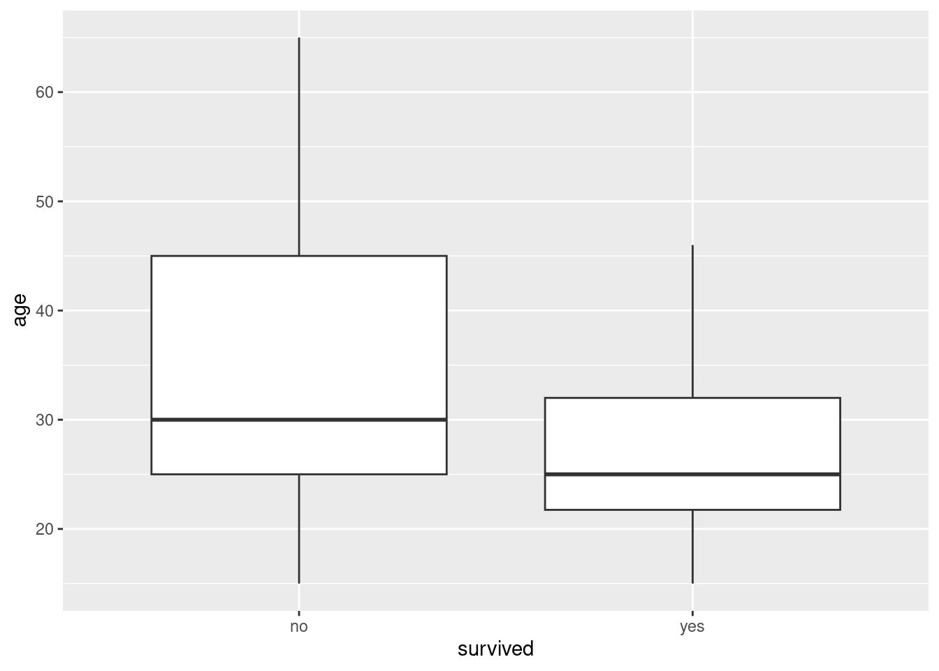
or:
ggplot(donner, aes(x = age)) + geom_histogram(bins = 10) + facet_grid(survived ~ .)
or:
donner %>% group_by(survived) %>% summarize(m = mean(age))For survived against gender, the obvious thing is a cross-tabulation, gotten like this:
with(donner, table(gender, survived)) survived
gender no yes
female 5 10
male 20 10or like this:
donner %>% group_by(gender, survived) %>% summarize(n = n())`summarise()` has grouped output by 'gender'. You can override using the
`.groups` argument.For a graph, borrow the grouped bar-plot idea:
ggplot(donner, aes(x = gender, fill = survived)) + geom_bar(position = "dodge")
I think this way around for x and fill is better, since we want to ask something like “out of the females, how many survived” (that is, gender is explanatory and survival response).
\(\blacksquare\)
- For each of the three graphs or summaries in the previous question, what do they tell you about the relationship between the pair of variables concerned? Explain briefly.
Solution
I think the graphs are the easiest thing to interpret, but use whatever you got:
The females on average were younger than the males. (This was still true with the medians, even though those very old males might have pulled the mean up.)
The people who survived were on average younger than those who didn’t (or, the older people tended not to survive).
A greater proportion of females survived than males.
A relevant point about each relationship is good.
\(\blacksquare\)
- Fit a logistic regression predicting survival from age and gender. Display the summary.
Solution
Each row of the data frame is one person, so we can use the survived column without going through that two-column response business. However, the response variable survived is a categorical variable expressed as text, so we need to make it into a factor first. Either create a new variable that is the factor version of survived, or do it right in the glm:
donner.1 <- glm(factor(survived) ~ age + gender, family = "binomial", data = donner)
summary(donner.1)
Call:
glm(formula = factor(survived) ~ age + gender, family = "binomial",
    data = donner)

Coefficients:
            Estimate Std. Error z value Pr(>|z|)
(Intercept)  3.23041    1.38686   2.329   0.0198 *
age         -0.07820    0.03728  -2.097   0.0359 *
gendermale  -1.59729    0.75547  -2.114   0.0345 *
---
Signif. codes:  0 '***' 0.001 '**' 0.01 '*' 0.05 '.' 0.1 ' ' 1

(Dispersion parameter for binomial family taken to be 1)

    Null deviance: 61.827  on 44  degrees of freedom
Residual deviance: 51.256  on 42  degrees of freedom
AIC: 57.256

Number of Fisher Scoring iterations: 4
We ought to take a moment to think about what is being predicted here:
levels(factor(donner$survived))[1] "no" "yes"The baseline is the first of these, no, and the thing that is predicted is the probability of the second one, yes (that is, the probability of surviving).
\(\blacksquare\)
- Do both explanatory variables have an impact on survival? Does that seem to be consistent with your numerical or graphical summaries? Explain briefly.
Solution
Both explanatory variables have a P-value (just) less than 0.05, so they both have an impact on survival: taking either one of them out of the logistic regression would be a mistake. To see if this makes sense, go back to your plots or summaries, the ones involving survival. For age, the mean or median age of the survivors was less than for the people who died, by five year (median) or eight years (mean), so it makes sense that there would be an age effect. For gender, two-thirds of the women survived and two-thirds of the men died, so there ought to be a gender effect and is.
\(\blacksquare\)
- Are the men typically older, younger or about the same age as the women? Considering this, explain carefully what the negative
gendermaleslope in your logistic regression means.
Solution
The men are typically older than the women. The negative (and significant) gendermale slope means that the probability of a male surviving is less than that of a woman of the same age. Or, though the males are typically older, even after you allow for that, the males have worse survival. (genderfemale is the baseline.) You need to get at the idea of “all else equal” when you’re assessing regression slopes of any kind: regular regression, logistic regression or survival analysis (coming up later). That’s why I said “carefully” in the question. If I say “carefully” or “precisely”, a complete answer is looking for a specific thing to show that you understand the issue completely.
\(\blacksquare\)
- Obtain predicted probabilities of survival for each combination of some representative ages and of the two genders in this dataset.
Solution
Make a dataframe containing some ages (you pick them) and the two genders, in combination, using datagrid:
summary(donner) age gender survived
Min. :15.0 Length:45 Length:45
1st Qu.:24.0 Class :character Class :character
Median :28.0 Mode :character Mode :character
Mean :31.8
3rd Qu.:40.0
Max. :65.0 new <- datagrid(model = donner.1, age = c(15, 25, 30, 40, 65), gender = c("female", "male"))
newcbind(predictions(donner.1, newdata = new)) %>%
select(estimate, age, gender)(There are five ages chosen, something like a five-number summary, and two genders here, so ten predictions.)
These, remember, are predicted probabilities of surviving.
Further investigation of the age effect:
summary(donner.1)
Call:
glm(formula = factor(survived) ~ age + gender, family = "binomial",
data = donner)
Coefficients:
Estimate Std. Error z value Pr(>|z|)
(Intercept) 3.23041 1.38686 2.329 0.0198 *
age -0.07820 0.03728 -2.097 0.0359 *
gendermale -1.59729 0.75547 -2.114 0.0345 *
---
Signif. codes: 0 '***' 0.001 '**' 0.01 '*' 0.05 '.' 0.1 ' ' 1
(Dispersion parameter for binomial family taken to be 1)
Null deviance: 61.827 on 44 degrees of freedom
Residual deviance: 51.256 on 42 degrees of freedom
AIC: 57.256
Number of Fisher Scoring iterations: 4new <- datagrid(model = donner.1, age = c(15, 25, 35, 45, 55))
new# on probability scale
cbind(predictions(donner.1, newdata = new)) %>%
select(estimate, age, gender)# on log-odds scale (constant differences)
cbind(predictions(donner.1, newdata = new, type = "link")) %>%
select(estimate, age, gender)# on odds scale (constant multiple)
cbind(predictions(donner.1, newdata = new, type = "link")) %>%
select(estimate, age, gender) %>%
mutate(estimate = exp(estimate))exp(-0.78)[1] 0.458406\(\blacksquare\)
- Do your predictions support your conclusions from earlier about the effects of age and gender? Explain briefly.
Solution
We said before that the probability of survival was lower if the age was higher. This is confirmed here: for example, look at the odd-numbered rows 1, 3, 5, 7, 9, which are all females of increasing ages; the probability of survival decreases. (Or look at males, in the even-numbered rows; the effect is the same.)
To see the effect of gender, look at two predictions of different genders but the same age (eg. rows 1 and 2). The female is always predicted to have the higher survival probability. This is also what we saw before. The effect of gender is substantial, but not strongly significant, because we only have 45 observations, not so many when all we know about each person is whether they survived or not. I wanted you to think about these different ways to understand the model, and to understand that they all say the same thing, in different ways (and thus you can look at whichever of them is most convenient or comprehensible). For the logistic and survival models, I find looking at predictions to be the easiest way to understand what the model is saying.
\(\blacksquare\)
27.19 Who needs the most intensive care?
The “APACHE II” is a scale for assessing patients who arrive in the intensive care unit (ICU) of a hospital. These are seriously ill patients who may die despite the ICU’s best attempts. APACHE stands for “Acute Physiology And Chronic Health Evaluation”.15 The scale score is calculated from several physiological measurements such as body temperature, heart rate and the Glasgow coma scale, as well as the patient’s age. The final result is a score between 0 and 71, with a higher score indicating more severe health issues. Is it true that a patient with a higher APACHE II score has a higher probability of dying?
Data from one hospital are in link. The columns are: the APACHE II score, the total number of patients who had that score, and the number of patients with that score who died.
- Read in and display the data (however much of it displays). Why are you convinced that have the right thing?
Solution
Data values separated by one space, so:
my_url <- "http://ritsokiguess.site/datafiles/apache.txt"
icu <- read_delim(my_url, " ")
Rows: 38 Columns: 3
── Column specification ────────────────────────────────────────────────────────
Delimiter: " "
dbl (3): apache, patients, deaths
ℹ Use `spec()` to retrieve the full column specification for this data.
ℹ Specify the column types or set `show_col_types = FALSE` to quiet this message.icuI had to stop and think about what to call the data frame, since one of the columns is called apache.
Anyway, I appear to have an apache score between 0 and something, a number of patients and a number of deaths (that is no bigger than the number of patients). If you check the original data, the apache scores go up to 41 and are all the values except for a few near the end, so it makes perfect sense that there would be 38 rows.
Basically, any comment here is good, as long as you make one and it has something to do with the data.
apache scores could be as high as 71, but I imagine a patient would have to be very ill to get a score anywhere near that high.
\(\blacksquare\)
- Does each row of the data frame relate to one patient or sometimes to more than one? Explain briefly.
Solution
Sometimes to more than one. The number in the patients column says how many patients that line refers to: that is to say (for example) the row where apache equals 6 represents all the patients whose apache score was 6, however many of them there were (14 in this case). I had to be careful with the wording because the first two rows of the data frame actually do refer to only one patient each (who survived in both cases), but the later rows do refer to more than one patient.
\(\blacksquare\)
- Explain why this is the kind of situation where you need a two-column response.
Solution
This needs a two-column response precisely because each row represents (or could represent) more than one observation. The two columns are the number of observations referring to the event of interest (dying), and the number of observations where that didn’t happen (survived).
That’s as far as you need to go.
\(\blacksquare\)
- Fit a logistic regression to estimate the probability of death from the
apachescore, and display the results.
Solution
apache.1 <- glm(cbind(deaths, patients - deaths) ~ apache, family = "binomial", data = icu)
summary(apache.1)
Call:
glm(formula = cbind(deaths, patients - deaths) ~ apache, family = "binomial",
    data = icu)

Coefficients:
            Estimate Std. Error z value Pr(>|z|)
(Intercept)  -2.2903     0.2765  -8.282  < 2e-16 ***
apache        0.1156     0.0160   7.227 4.94e-13 ***
---
Signif. codes:  0 '***' 0.001 '**' 0.01 '*' 0.05 '.' 0.1 ' ' 1

(Dispersion parameter for binomial family taken to be 1)

    Null deviance: 106.009  on 37  degrees of freedom
Residual deviance:  43.999  on 36  degrees of freedom
AIC: 125.87

Number of Fisher Scoring iterations: 4
My naming convention has gotten messed up again. This should really be called deaths.1 or something like that, but that would be a really depressing name.
\(\blacksquare\)
- Is there a significant effect of
apachescore on the probability of survival? Explain briefly.
Solution
A gimme two points. The P-value for apache is \(4.94
\times 10^{-13}\), very small, so apache score definitely has an effect on the probability of survival.
\(\blacksquare\)
- Is the effect of a larger
apachescore to increase or to decrease the probability of death? Explain briefly.
Solution
The slope coefficient for apache is 0.1156, positive, and since we are modelling the probability of death (the first column of the response matrix), this says that as apache goes up, the probability of death goes up as well. If you made your response matrix with the columns the other way around, the slope coefficient for apache should be \(-0.1156\), but the explanation should come to the same place, because this says that the probability of survival goes down as apache goes up.
\(\blacksquare\)
- Obtain the predicted probability of death for a representative collection of the
apachescores that were in the data set. Do your predictions behave as you would expect (from your earlier work)?
Solution
“Representative” is a clue that you can choose more or less what values you like. The median and quartiles, or the five-number summary, or something near those, are reasonable choices:
summary(icu) apache patients deaths
Min. : 0.00 Min. : 1.00 Min. : 0.000
1st Qu.:10.25 1st Qu.: 3.00 1st Qu.: 1.000
Median :19.50 Median :11.50 Median : 4.000
Mean :19.55 Mean :11.95 Mean : 4.605
3rd Qu.:28.75 3rd Qu.:17.75 3rd Qu.: 7.000
Max. :41.00 Max. :33.00 Max. :13.000 new <- datagrid(model = apache.1, apache = c(10, 20, 30))
newcbind(predictions(apache.1, newdata = new)) %>%
select(apache, estimate, conf.low, conf.high)Display a reasonably small number of columns.
As the apache score goes up, the predicted probability of death also goes up. This is what we would expect to see given the positive slope on apache in the model apache.1. (Again, if your model had the columns of the response the other way around, you were predicting the probability of survival, and your predictions should then show it going down rather than up to go with the negative slope you would then have had.)
\(\blacksquare\)
- Make a plot of predicted death probability against
apachescore, with, also on the plot, the observed proportion of deaths within eachapachescore, plotted againstapachescore. Does there seem to be good agreement between observation and prediction? Hint: calculate what you need to from the original dataframe first, save it, then make a plot of the predictions, and then to the plot add the appropriate thing from the dataframe you just saved.
Solution
All right, following the hint, let’s start with the original dataframe, called icu. The plot of the predictions is going to show predicted probabilities of death, so from the data we need to find the observed proportions of death at each apache score. Our dataframe has one row for each apache score, so this is not too hard. We have the total number of patients at each score, and the number of deaths out of those patients, so the proportion that died is the second of those divided by the first one:
icu %>% mutate(proportion = deaths / patients) -> d
d
That looks all right.
To plot predicted values, plot_predictions:
plot_predictions(apache.1, condition = "apache")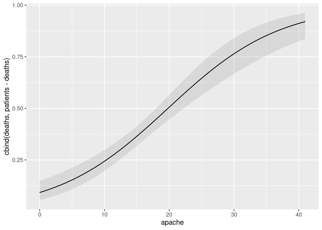
This again shows that the predicted probability of death goes up sharply with apache score. Let’s add the data to this graph. The trick is to remember how to add points to a graph you already have, when the points come from a different data set:
plot_predictions(apache.1, condition = "apache") +
  geom_point(data = d, aes(x = apache, y = proportion))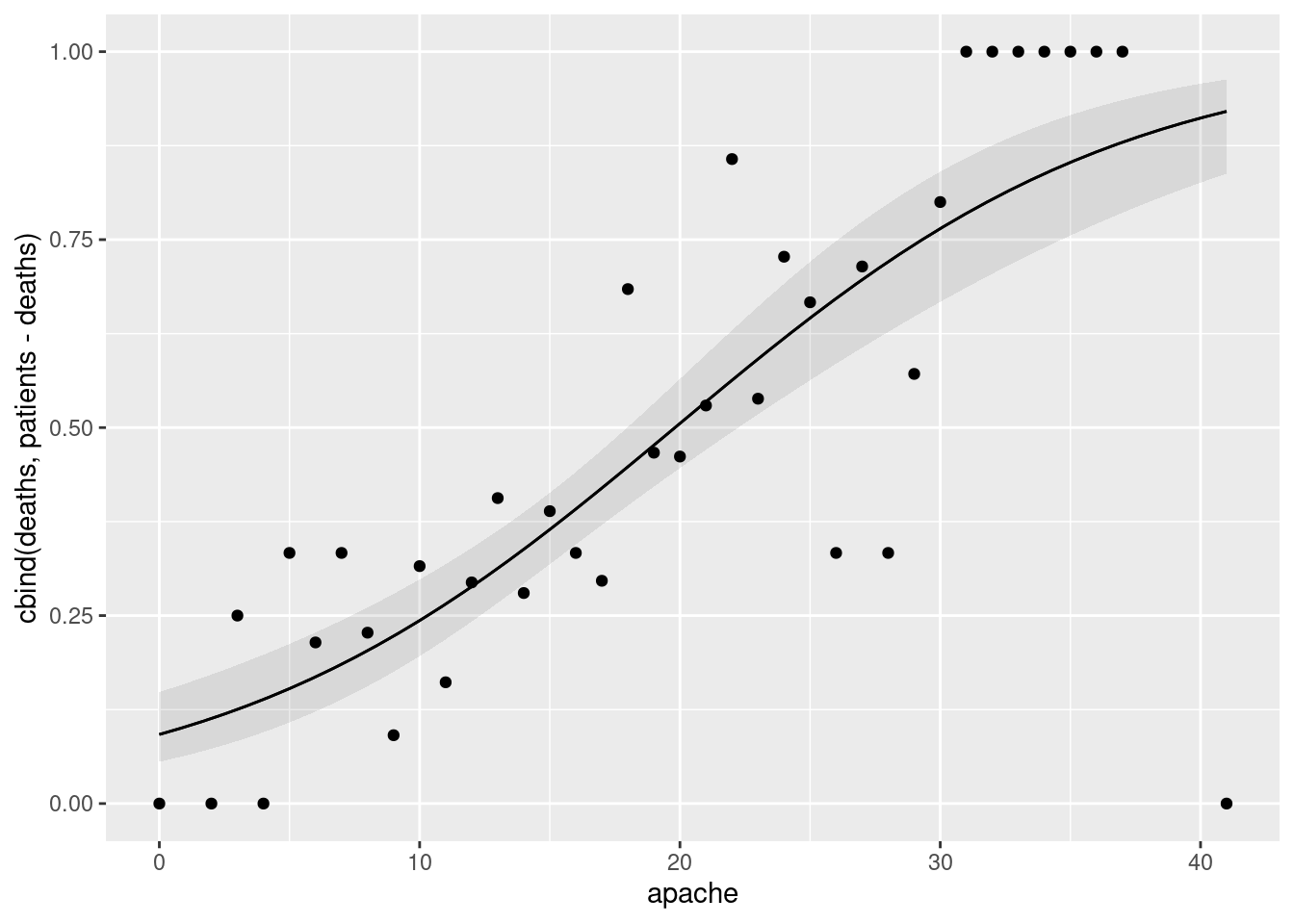
That does a reasonably good job, but we can do better. We observe now that most of the points are reasonably close to the curve, except for that one in the bottom right, a patient who had the highest apache score of all, but who happened to survive. The observed proportions that are 1 or 0 over on the right might have been based on only one patient, and the others might have been based on more. So it would be better to encode how many patients each point is based on, for example by the size of the point (you may be able to think of other ways like colour, and you can experiment to see what gets the message across best in your opinion).
All right, we can make the points different sizes according to the number of patients they are based on, thus:
plot_predictions(apache.1, condition = "apache") +
  geom_point(data = d, aes(x = apache, y = proportion, size = patients))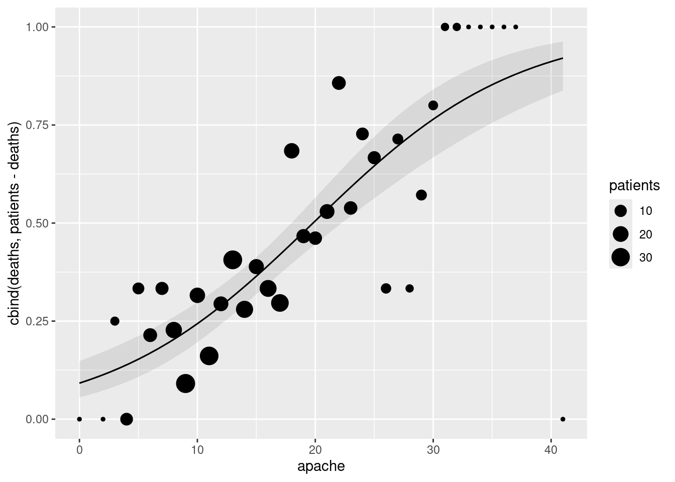
This shows clearly that the points on the left and right of the graph are based on very few patients, maybe only one each time. But most of the scores between about 10 and 20 were represented by more patients, maybe up to 30. The bigger circles seem to follow the trend of the predictions pretty well, which is what we were hoping for; the proportions based on small numbers of patients might be further away from the predictions, and that’s all right.
Extra: you can see that we want the proportions to be based on reasonable numbers of patients, but the other end of the issue is that we don’t want to combine patients with very different apache scores, because then you wouldn’t get much of a picture of how well the data follow the trend. This is very much the same idea as choosing the number of bins on a histogram; if you have too many bins, each one will contain very few observations and you won’t see the pattern very clearly, but if you have too few bins, you’ll have lots of observations in each bin but you still won’t see the shape.
With that in mind, perhaps we can try binning the observations in our data here. Let’s see what that does. The starting point is to redefine what I called d before which had the proportion in it:
break_points <- seq(-1, 45, 4)
break_points
[1] -1 3 7 11 15 19 23 27 31 35 39 43icu %>% mutate(bins = cut(apache, breaks = break_points))My bins are 4 apache points wide. I have no idea yet whether that’s any good, but I want to get the procedure down so that I can come back and change that later if I want to.
What I am using to make the bins is a base R function called cut. This makes categorical bins out of a quantitative variable (which is normally a bad idea, but we have our reasons here). It takes two inputs: a vector of numbers to bin, and the points that divide one bin from the next, which I defined into a vector called break_points first. The function cut defines bins as “half-open”, meaning that the top end is included but the bottom end is excluded. (Note for example which bin an apache score of 3 goes into.)
Now we want to total up the patients and deaths within each bin, and, for reasons you’ll see later, we want to know where the middle of each bin is (for which I will use the median of the apache scores within that bin):
icu %>% mutate(bins = cut(apache, breaks = break_points)) %>%
  group_by(bins) %>%
  summarize(patients = sum(patients), deaths = sum(deaths), apache = median(apache))
We have redefined the names: patients and deaths are now the totals of patients and deaths within each bin, and apache is now something like the middle apache score in each bin.
Now we can work out the proportion of patients that died within each bin, and save that:
icu %>% mutate(bins = cut(apache, breaks = break_points)) %>%
  group_by(bins) %>%
  summarize(patients = sum(patients), deaths = sum(deaths), apache = median(apache)) %>%
  mutate(proportion = deaths / patients) -> d
d
Now we redo our graph, but using the proportions in here as the observed proportions of deaths in the data. You might now realize the reason for those values in the apache column: on the graph, the proportion values will be our \(y\) coordinates, but we needed something to be the \(x\) coordinates.
Actually redrawing our graph is in fact exactly the same code as before; the thing that has changed is our definition of d in it:
plot_predictions(apache.1, condition = "apache") +
  geom_point(data = d, aes(x = apache, y = proportion, size = patients))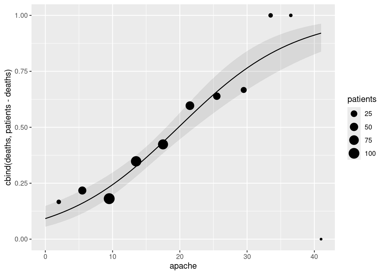
And now we see, with more patients per bin, that the agreement between data and prediction is very good apart from the very small bins on the right.
One modification that you might like to pursue is to have variable-width bins: wider bins at the extremes and narrower bins in the middle, so that each bin has about the same number of patients. You could do this by modifying what I called break_points so that the numbers in it are more spread out at the extremes and closer together in the middle.
Extra extra: if you’re a football fan, you could imagine doing a very similar analysis by modelling the probability of successfully kicking a field goal as it depends on the distance it is attempted from. This would probably work pretty well for the NFL and (no doubt) for the CFL as well. In both these codes of football, field goals are always attempted from between two side-to-side marks on the field called “hash marks”. In the NFL, the hash marks are close together, so field goals are attempted from more or less directly in front of the goalposts. In the CFL, the hash marks are further apart, so a field goal might be attempted from off to the side of the goalposts, and then the probability of success might also depend on how far off to the side you are.
If you happen also to be a rugby fan, you’ll know that kicks at goal might need to be attempted from anywhere on the field, even out near the sidelines, and in that case, the chance of kicking a goal definitely depends on where on the field you are kicking it from as well as how far out it is.
Extra extra extra: football (NFL and CFL) have an effective formality called the “point after”: after a team scores a touchdown, the kicker kicks at goal from right in front of the posts, which is almost never missed. In rugby, the equivalent to a touchdown is called a “try”, and to score a try the player must literally touch the ball down. (Thus, to a rugby fan, the NFL and CFL “touchdowns” are absurd misnomers.) After a try is scored, there is a kick at goal (called a “conversion”) which is not taken from right in front of the posts like in the NFL, but from the side-to-side position on the field where the try was scored. Thus, if a try is scored near the sidelines, as it often is, the conversion has to be kicked from near the sideline as well. The kicker can go as far back down the field as they like, but as you might imagine, a sideline conversion is still very difficult to kick.
Extra-to-the-fourth: the reason for those names in rugby. In the old days, if a team scored a try and kicked the conversion as well, it was called a “goal”, and as a rugby player, you wanted your team to score a goal. Scoring a try allowed a team to “try” to “convert” it into a “goal” by kicking the conversion, hence the names. Because the NFL and CFL have their roots in rugby, they have the “point after” a touchdown as well (with the option now of allowing teams to try for two points after a touchdown as well).
\(\blacksquare\)
27.20 Go away and don’t come back!
When a person has a heart attack and survives it, the major concern of health professionals is to prevent the person having a second heart attack. Two factors that are believed to be important are anger and anxiety; if a heart attack survivor tends to be angry or anxious, they are believed to put themselves at increased risk of a second heart attack.
Twenty heart attack survivors took part in a study. Each one was given a test designed to assess their anxiety (a higher score on the test indicates higher anxiety), and some of the survivors took an anger management course. The data are in link; y and n denote “yes” and “no” respectively. The columns denote (i) whether or not the person had a second heart attack, (ii) whether or not the person took the anger management class, (iii) the anxiety score.
- Read in and display the data.
Solution
my_url <- "http://ritsokiguess.site/datafiles/ha2.txt"
ha <- read_delim(my_url, " ")
Rows: 20 Columns: 3
── Column specification ────────────────────────────────────────────────────────
Delimiter: " "
chr (2): second, anger
dbl (1): anxiety
ℹ Use `spec()` to retrieve the full column specification for this data.
ℹ Specify the column types or set `show_col_types = FALSE` to quiet this message.haThe anxiety scores are numbers; the other two variables are “yes” and “no”, which makes perfect sense.
\(\blacksquare\)
- * Fit a logistic regression predicting whether or not a heart attack survivor has a second heart attack, as it depends on anxiety score and whether or not the person took the anger management class. Display the results.
Solution
This:
ha.1 <- glm(factor(second) ~ anger + anxiety, family = "binomial", data = ha)
summary(ha.1)
Call:
glm(formula = factor(second) ~ anger + anxiety, family = "binomial",
    data = ha)

Coefficients:
            Estimate Std. Error z value Pr(>|z|)
(Intercept) -6.36347    3.21362  -1.980   0.0477 *
angery      -1.02411    1.17101  -0.875   0.3818
anxiety      0.11904    0.05497   2.165   0.0304 *
---
Signif. codes:  0 '***' 0.001 '**' 0.01 '*' 0.05 '.' 0.1 ' ' 1

(Dispersion parameter for binomial family taken to be 1)

    Null deviance: 27.726  on 19  degrees of freedom
Residual deviance: 18.820  on 17  degrees of freedom
AIC: 24.82

Number of Fisher Scoring iterations: 4
There’s no need to worry about two-column responses here, because each row of the data frame refers to only one person, and the response variable second is already a categorical variable with two categories (that needs to be turned into a factor for glm).
\(\blacksquare\)
- In the previous part, how can you tell that you were predicting the probability of having a second heart attack (as opposed to the probability of not having one)?
Solution
The levels of a factor are taken in alphabetical order, with n as the baseline, so we are predicting the probability of the second one y.
\(\blacksquare\)
- * For the two possible values
yandnofangerand the anxiety scores 40, 50 and 60, make a data frame containing all six combinations, and use it to obtain predicted probabilities of a second heart attack. Display your predicted probabilities side by side with what they are predictions for.
Solution
This time, I give you the values I want the predictions for (as opposed to calculating something like quartiles from the data), so we might as well just type them in.
First step, datagrid:
new <- datagrid(model = ha.1, anger = c("y", "n"), anxiety = c(40, 50, 60))
new
Then, the predictions:
cbind(predictions(ha.1, newdata = new))Extra: In the help file for predictions, you will see it done in one step, with code like
predictions(ha.1, newdata = datagrid(anger = c("y", "n"), ...))This saves constructing new first, but the code for datagrid is to my mind usually rather long to fit on one line inside the predictions(...).
\(\blacksquare\)
- Use your predictions from the previous part to describe the effect of changes in
anxietyandangeron the probability of a second heart attack.
Solution
The idea is to change one variable while leaving the other fixed. (This is the common refrain of “all else equal”.)
Pick a level of anger, say n (it doesn’t matter which) and look at the effect of anxiety. The probability of a second heart attack increases sharply from 0.17 to 0.40 to 0.69. So an increased anxiety score is associated with an increased probability of second heart attack (all else equal).
To assess the effect of taking the anger management course, pick an anxiety value, say 40, and compare the probabilities for anger n and y. For someone who has not taken the anger management course, the probability is 0.17, but for someone who has, it drops all the way to 0.07. (The pattern is the same at the other anxiety scores.)
Extra: the reason it doesn’t matter what value of the other variable you look at (as long as you keep it fixed) is that the model is “additive” with no interaction, so that the effect of one variable does not depend on the value of the other one. If we wanted to see whether the effect of anxiety was different according to whether or not the person had taken the anger management course, we would add an interaction between anxiety and anger. But we won’t be doing this kind of thing until we get to analysis of variance, so you don’t need to worry about it yet.
\(\blacksquare\)
- Are the effects you described in the previous part consistent with the
summaryoutput fromglmthat you obtained in (here)? Explain briefly how they are, or are not. (You need an explanation for each ofanxietyandanger, and you will probably get confused if you look at the P-values, so don’t.)
Solution
In the previous part, we found that increased anxiety went with an increased probability of second heart attack. Back in (here), we found a positive slope of 0.11904 for anxiety, which also means that a higher anxiety score goes with a higher probability of second heart attack. That was not too hard. The other one is a little more work. anger is categorical with two categories n and y. The first one, n, is the baseline, so angery shows how y compares to n. The slope \(-1.04211\) is negative, which means that someone who has taken the anger management course has a lower probability of a second heart attack than someone who hasn’t (all else equal). This is the same story that we got from the predictions. That’s it for that, but I suppose I should talk about those P-values. anxiety is significant, so it definitely has an effect on the probability of a second heart attack. The pattern is clear enough even with this small data set. Here’s a visual:
ggplot(ha, aes(x = second, y = anxiety)) + geom_boxplot()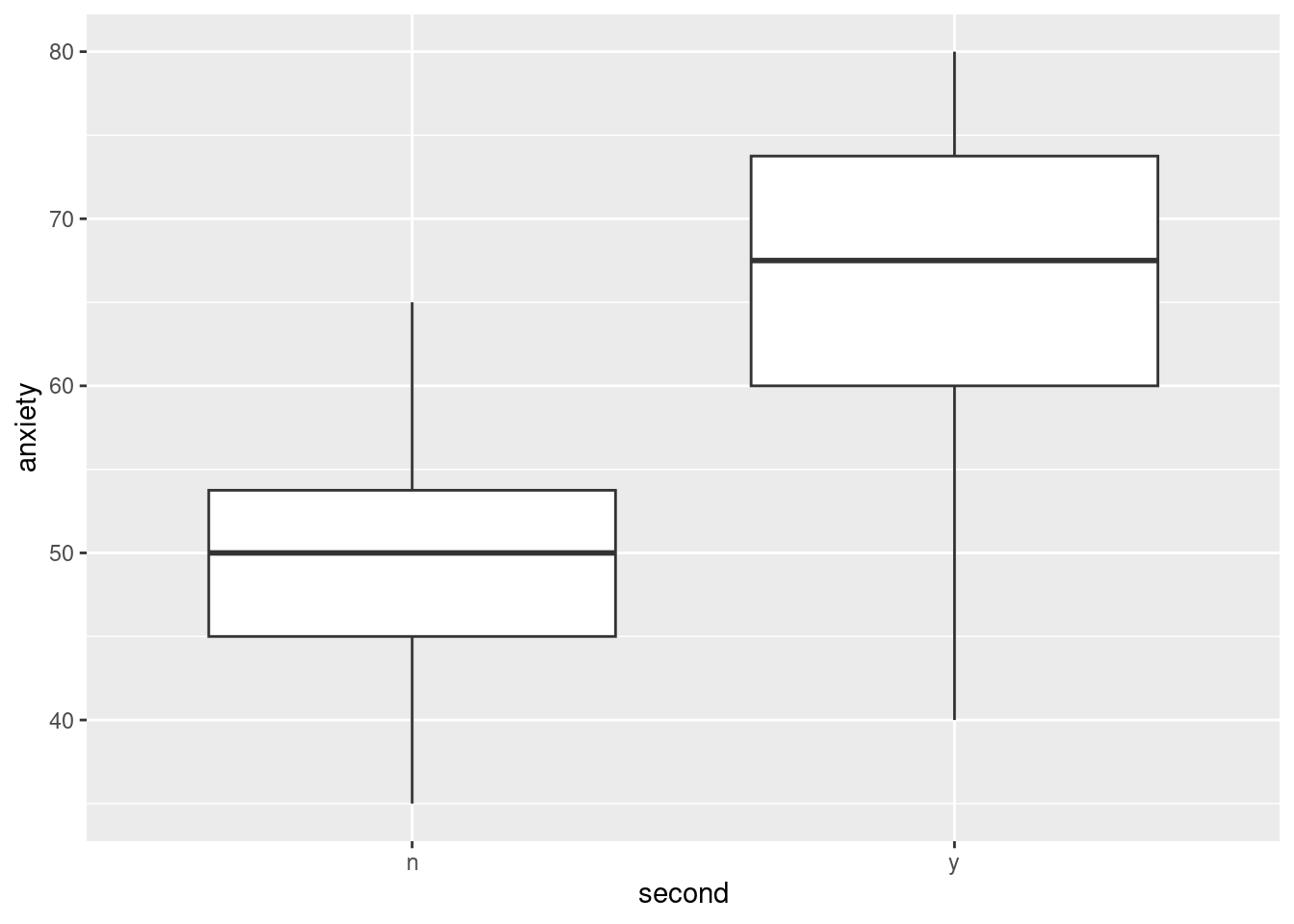
This is the wrong way around in terms of cause and effect, but it shows pretty clearly that people who suffer a second heart attack have a higher level of anxiety than those who don’t.
That’s clear enough, but what about anger? That is not significant, but there seems to be a visible effect of anger on the predicted probabilities of (here): there we saw that if you had done the anger management course, your probability of a second heart attack was lower. But that’s only the predicted probability, and there is also uncertainty about that, probably quite a lot because we don’t have much data. So if we were to think about confidence intervals for the predicted probabilities, they would be wide, and for the two levels of anger at a fixed anxiety they would almost certainly overlap.
Another way of seeing that is a visual, which would be a side-by-side bar chart:
ggplot(ha, aes(x = anger, fill = second)) + geom_bar(position = "dodge")
A small majority of people who took the anger management did not have a second heart attack, while a small minority of those who did not, did.16 But with these small numbers, the difference, even though it points the way we would have guessed, is not large enough to be significant:
with(ha, table(anger, second)) second
anger n y
n 4 7
y 6 3This is not nearly far enough from an equal split to be significant. (It’s the same kind of idea as for Mood’s median test in C32/C33.)
\(\blacksquare\)
I get confused about the difference between morals and ethics. [This is a very short description of that difference:] (http://smallbusiness.chron.com/differences-between-ethical-issues-moral-issues-business-48134.html). The basic idea is that morals are part of who you are, derived from religion, philosophy etc. Ethics are how you act in a particular situation: that is, your morals, what you believe, inform your ethics, what you do. That’s why the students had to play the role of an ethics committee, rather than a morals committee; presumably the researcher had good morals, but an ethics committee had to evaluate what he was planning to do, rather than his character as a person.↩︎
As with many of these acronyms, you get the idea that the acronym came first and they devised some words to fit it.↩︎
My daughter learned the word pre-empt because we like to play a bridge app on my phone; in the game of bridge, you make a pre-emptive bid when you have no great strength but a lot of cards of one suit, say seven, and it won’t be too bad if that suit is trumps, no matter what your partner has. If you have a weakish hand with a lot of cards in one suit, your opponents are probably going to be able to bid and make something, so you pre-emptively bid first to try and make it difficult for them.↩︎
This kind of thing is sometimes called an inverse prediction.↩︎
The usual application of this is to combine a number with a vector. If you try to subtract a length-2 vector from a length-6 vector, R will repeat the shorter one three times and do the subtraction, but if you try to subtract a length-2 vector from a length-7 vector, where you’d have to repeat the shorter one a fractional number of times, R will do it, but you’ll get a warning, because this is probably not what you wanted. Try it and see.↩︎
The test is this way because it’s a generalized linear model rather than a regular regression.↩︎
See, I told you it was a little confusing.↩︎
When you have one observation per line, the predictions are of the second of the two levels of the response variable. When you make that two-column response, the predictions are of the probability of being in the first column. That’s what it is. As the young people say, don’t @ me.↩︎
When you have higher-order terms, you have to keep the lower-order ones as well: higher powers, or interactions (as we see in ANOVA later).↩︎
I get confused about the difference between morals and ethics. [This is a very short description of that difference:] (http://smallbusiness.chron.com/differences-between-ethical-issues-moral-issues-business-48134.html). The basic idea is that morals are part of who you are, derived from religion, philosophy etc. Ethics are how you act in a particular situation: that is, your morals, what you believe, inform your ethics, what you do. That’s why the students had to play the role of an ethics committee, rather than a morals committee; presumably the researcher had good morals, but an ethics committee had to evaluate what he was planning to do, rather than his character as a person.↩︎
If you can believe it.↩︎
If you took STAB23, you’ll have used PSPP, which is a free version of SPSS.↩︎
If it is for you, go right ahead, but for me it wasn’t.↩︎
I realize I am extrapolating with these values.↩︎
As with many of these acronyms, you get the idea that the acronym came first and they devised some words to fit it.↩︎
Read that carefully.↩︎